Sword Sanctuary scores 68/100 — better than 17% of Souls-like capsules (n=429).

Quick text summary

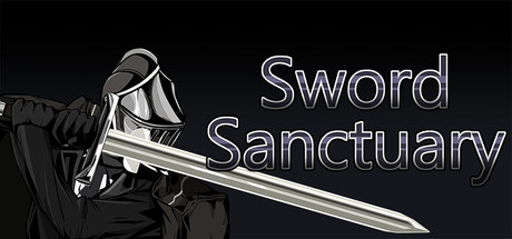
Sword Sanctuary scored 68/100 on Steam Analyzer — Solid for a Souls-like capsule. Top priority fix: [uniqueness_polish] Introduce a distinctive visual element such as a signature weapon design, unique armor ornament, or color accent (e.g., glowing sanctuary rune, gilded detail) that differentiates the knight and creates a memorable brand signature.

Capsule scores by dimension

  • Genre Clarity: 8/10 — Strong melee combat action identity. The large sword and armored knight silhouette immediately signal action combat and swordplay focus. At tiny size, the weapon remains the dominant visual anchor and clearly communicates a blade-based gameplay loop. The pose and armor styling reinforce medieval fantasy action over puzzle or strategy game.
  • Title Readability: 7/10 — Clear at full size, acceptable at small. Title text 'Sword Sanctuary' is cleanly rendered in white outline font centered in the upper right with good contrast against the dark background. At small and tiny sizes the text remains legible but the outline weight becomes thinner and letter spacing tightens slightly, reducing impact. The positioning avoids the character on the left, protecting readability across crop scenarios.
  • Contrast & Color: 8/10 — Strong value separation, clean silhouette. White and light gray armor and blade stand out sharply against the near-black background, creating excellent luminance contrast. The character silhouette remains distinct and readable at tiny size with no muddy blending. The cool silver palette and dark clothing create clear edge definition that survives a grayscale conversion.
  • Uniqueness & Polish: 6/10 — Competent but visually generic approach. The knight-with-sword composition is a familiar trope in action RPG marketing, similar to many top-tier peers like Armored Core VI and Lies of P. While the rendering quality is clean and the pose is dynamic, there is no distinctive visual hook, unique art style, or signature mechanic cue that sets it apart from genre conventions. The capsule communicates 'swordplay action' clearly but does not convey what makes Sword Sanctuary unique.
  • Brand Consistency: 5/10 — Limited internal identity signals. The design uses standard fantasy knight armor and a longsword with no memorable motif, icon, or signature palette that would aid recognition in future materials. The monochromatic silver-and-black color scheme is functional but offers no distinctive brand cue. Without access to in-game UI or character art, the capsule reads as generic medieval action rather than conveying a recognizable identity for Sword Sanctuary specifically.
  • Composition: 7/10 — Strong focal point with minor spacing concerns. The knight and sword occupy the left-center and dominate attention, while title text anchors the upper right, creating clear visual hierarchy and separation of elements. At small sizes the composition remains readable with the sword as the unambiguous primary subject. The title placement avoids overlap but sits relatively close to the edge; at extreme crops (240px width) the right letters may feel tight.

What works

  • Clear genre iconography. Knight armor and large sword unmistakably signal melee action combat, making the gameplay type obvious at a glance even at tiny thumbnail size.
  • Excellent contrast and silhouette. White armor and blade read sharply against dark background with strong value separation that survives grayscale conversion and remains distinct at small sizes.
  • Clean technical execution. The render quality is polished, character lighting is consistent, and the typography is legible across all viewing sizes without artifacts or muddy edges.

What hurts the capsule

  • Generic knight trope without differentiation. The composition closely mirrors common action RPG capsule templates used by competitors, offering no visual hook that communicates what makes Sword Sanctuary's core mechanic or story unique.
  • No memorable brand identity or motif. The capsule lacks a signature color, symbol, or recognizable asset that could serve as a recall cue for future marketing or enable players to spot the game instantly on a wishlist.
  • Limited environmental or contextual storytelling. The dark void background provides no sense of setting, sanctuary aesthetic, or NPC opponent variety; a glimpse of the swordsmaster environment or opponent would strengthen the narrative hook.

Priority fixes

  1. [uniqueness_polish] Introduce a distinctive visual element such as a signature weapon design, unique armor ornament, or color accent (e.g., glowing sanctuary rune, gilded detail) that differentiates the knight and creates a memorable brand signature.
  2. [brand_consistency] Add a subtle environmental or thematic background cue—such as a faint sanctuary arch, opponent silhouettes, or glowing effects—that hints at the game's core loop and story without cluttering the composition.
  3. [composition] Evaluate edge safety margins on the title text at 240px width to ensure the rightmost letters remain readable and do not risk crop-induced truncation on small Steam widget placements.

Store copy priority fixes

  1. [hook_strength] Rewrite the short description opening to lead with the parry mechanic and stakes: 'Master the perfect parry or fall—challenge a sanctuary of deadly swordmasters to claim the title of Sword Saint.' This immediately conveys core gameplay and emotional tension.
  2. [uniqueness] Add 1–2 sentences explaining what makes this parry system or encounter design distinct: e.g., 'Each opponent has a unique parry rhythm; mastering their tells is key to victory' or 'Parrying is not just defense—it's your primary source of healing and offense.'
  3. [feature_communication] Expand the opponent description with specific examples: mention 1–2 enemy types, boss names, or combat archetypes so the player can imagine actual encounters instead of vague 'various opponents.'
  4. [tone_match] Inject more martial, intense language into the detailed description—replace 'The knight came to the sanctuary' with 'Enter the Sword Sanctuary and face warriors of legend' to match the hardcore souls-like tone.

Related guides

Steam app ID: 3344250 · Tags: Souls-like, Action, RPG, 2D Fighter, Medieval