Scoring genre clarity...

Dungeon Rummage - Survival capsule

Dungeon Rummage - Survival

Dungeon Rummage - Survival is a bite-sized, Survival-lite, Turn-based Dungeon crawler with a cozy vibe.

$3.99Positive(20)
CasualSingleplayerSurvival
Simple GamingFeb 3, 2025

Dungeon Rummage - Survival scores 75/100 — better than 65% of Casual capsules (n=10,372).

Positive (20 reviews) · $3.99 · Released Feb 3, 2025 · By Simple Gaming

Quick text summary

Dungeon Rummage - Survival scored 75/100 on Steam Analyzer — Good for a Casual capsule. Top priority fix: [genre_clarity] Add a subtle visual indicator of survival mechanics (e.g., resource counter, torch, or survival-specific UI element) to reinforce the 'survival-lite' subgenre at TINY size

Capsule scores by dimension

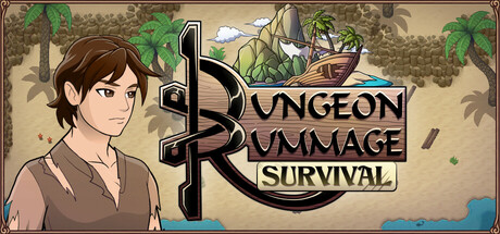
  • Genre Clarity: 7/10 — Dungeon crawler with cozy charm clear. The illustrated character in casual brown clothing, dungeon setting with vines and wooden structures, and turn-based UI cues immediately signal a fantasy dungeon crawler with relaxed tone. At TINY size the character silhouette and logo remain distinguishable, though the specific 'survival-lite' subgenre is less obvious without reading the tagline. The warm earth tones and character-forward composition read as casual rather than combat-heavy.
  • Title Readability: 8/10 — Logo legible, tagline readable at sizes. The 'Dungeon Rummage' logo uses clear serif letterforms with good black-white contrast against the tan background, maintaining legibility at SMALL size. The 'SURVIVAL' tagline sits cleanly below in capital letters with adequate spacing. At TINY size the logo remains parseable though fine serifs soften slightly, and the overall text hierarchy holds without collapsing.
  • Contrast & Color: 8/10 — Strong warm palette pops clearly. The warm tan-brown background with green foliage accents and the character's warm brown tones create excellent value separation against Steam's dark #1b2838 background. The black logo outline provides crisp silhouette definition, and the character figure stands out with clear lighting separation from the scene. In grayscale the light-to-midtone range maintains good readability without muddy mid-tones.
  • Uniqueness & Polish: 7/10 — Polished art style, modest visual hook. The hand-illustrated character and environment show clean craft and intentional character design that avoids generic fantasy tropes. The cozy aesthetic is coherent and feels purposeful rather than generic, with warm color grading and slightly stylized proportions lending personality. However, the overall visual storytelling remains somewhat understated—it communicates tone well but lacks a bold unique mechanic or standout visual moment that would elevate it above other indie crawlers.
  • Brand Consistency: 7/10 — Recognizable character identity, cohesive style. The illustrated protagonist establishes an iconic focal point with consistent character design language, and the warm earthy palette with green accents is memorable and distinct. The serif logo and overall aesthetic direction are cohesive and would be recognizable across promotional materials. The style feels intentional rather than assembled, though the identity could be stronger with more signature visual motifs or symbolic elements.
  • Composition: 8/10 — Strong focal point, balanced hierarchy. The character positioned left-center creates a natural focal point that draws immediate attention, while the logo anchors the right side without competing for dominance. The dungeon background elements frame the composition with good depth layering—foreground character, midground scene detail, background foliage—creating visual hierarchy. Safe margins are respected, and the design maintains clarity at SMALL and TINY sizes without awkward cropping or edge-hugging text.

What works

  • Character-driven focal point. The illustrated protagonist immediately establishes identity and warmth, creating an emotional anchor that differentiates the capsule from purely mechanical dungeon crawlers.
  • Legible logo with clear contrast. The serif 'Dungeon Rummage' text maintains strong black-on-tan readability even at TINY size, with proper outline definition preventing letterform collapse.
  • Cohesive warm color palette. The tan, brown, and green tones create excellent separation from Steam's dark background while establishing a unified cozy aesthetic across all elements.

What hurts the capsule

  • Subtle visual hook for survival mechanic. The capsule communicates 'dungeon crawler with cozy vibe' effectively but doesn't visually highlight what makes the survival-lite gameplay distinctive or compelling at a glance.
  • Limited memorable brand motifs. While the character design is solid, the capsule lacks signature symbols, patterns, or visual shorthand that would create instant recognition in future promotional materials.
  • Tagline secondary at small sizes. The 'SURVIVAL' tagline, while readable at SMALL size, becomes less prominent at TINY size, potentially losing the survival-specific genre qualifier in quick scrolls.

Priority fixes

  1. [genre_clarity] Add a subtle visual indicator of survival mechanics (e.g., resource counter, torch, or survival-specific UI element) to reinforce the 'survival-lite' subgenre at TINY size
  2. [uniqueness_polish] Introduce a signature visual motif or symbol in the logo or scene that becomes an iconic brand identifier for future marketing materials
  3. [composition] Consider emphasizing the 'SURVIVAL' tagline with slightly increased size or weight so it remains equally visible at TINY size alongside the main logo

Store copy priority fixes

  1. [hook_strength] Rewrite the short description to lead with the player's goal: 'Stranded on a remote island, gather supplies and brave a deadly dungeon to escape home in this cozy turn-based survival crawler.' This puts player agency and stakes first.
  2. [uniqueness] Add 1–2 sentences to the detailed description explaining what makes the camp management or combat progression special (e.g., 'Permanent upgrades persist across runs' or 'Randomized material spawns keep exploration fresh').
  3. [feature_communication] Expand the detailed description with a sentence or two on how crafting directly impacts combat or survival (e.g., 'Meals boost HP, potions grant tactical advantages in turn-based battles'), making the gameplay loop more vivid.

Related guides

Steam app ID: 3345880 · Tags: Casual, Singleplayer, Survival, Dungeon Crawler, Relaxing