Scoring genre clarity...

Ninja Vs. Zombies 3 capsule

Ninja Vs. Zombies 3

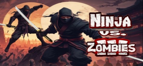
Fight Zombies, Monsters and a Nightmare with your Skills and Upgrades, use your Sword correctly and escape with Smoke Bombs, blast your way or smash Undead side by side with your Ninja Elite like never before. Action-packed meets Survival RogueElite Ninja Game.

$4.99Positive(11)
Action RoguelikeRogueliteRPG
KDGApr 1, 2025

Ninja Vs. Zombies 3 scores 62/100 — better than 2% of Action Roguelike capsules (n=1,675).

Positive (11 reviews) · $4.99 · Released Apr 1, 2025 · By KDG

Quick text summary

Ninja Vs. Zombies 3 scored 62/100 on Steam Analyzer — Solid for a Action Roguelike capsule. Top priority fix: [uniqueness_polish] Introduce a distinctive character design or signature visual element (iconic ninja pose, color accent, or UI motif) that differentiates from generic ninja-zombie mashups

Capsule scores by dimension

  • Genre Clarity: 7/10 — Clear action ninja combat theme. The silhouette of a ninja wielding a sword against a large moon backdrop with zombie-like figures in the background immediately communicates action combat with a supernatural survival angle. At TINY size, the ninja pose and sword are still recognizable, though the zombie details fade into the background atmosphere. The genre reads as action-oriented melee combat with monster-fighting elements.
  • Title Readability: 6/10 — Readable but generic styling. The title 'NINJA VS. ZOMBIES' is displayed in a bold, outlined white font positioned in the upper-right quadrant with strong contrast against the warm background. At SMALL size it remains legible, but at TINY size the fine serifs and outline detail become softer and slightly harder to parse due to the decorative font choice. The font is functional but not distinctively premium.
  • Contrast & Color: 7/10 — Strong warm backdrop with good silhouette. The warm orange-amber gradient moonlit background contrasts well against the dark ninja silhouette in the foreground, creating clear separation even at reduced sizes. The black ninja figure stands out distinctly against the lighter sky and moon, maintaining readability in grayscale. The foreground subject has clean edges and the value separation supports quick recognition during scroll.
  • Uniqueness & Polish: 5/10 — Competent but familiar concept. The ninja versus zombie premise is a straightforward mashup of two popular game tropes, executed with decent visual clarity but lacking distinctive art style or memorable hook. The composition and effects feel serviceable rather than innovative—a silhouetted ninja against a sunset is a common action game visual. While the rendering is clean, there is no signature visual storytelling or unique selling point that distinguishes it from similar indie action titles.
  • Brand Consistency: 5/10 — No memorable identity signals. The capsule presents a generic ninja and zombie scenario without iconic character design, signature color palette, or recognizable motifs that would allow repeat identification. The art style is functional but not distinctive enough to build brand recognition across multiple touchpoints. Without access to in-game UI or character assets, the capsule does not establish a coherent visual identity unique to this title.
  • Composition: 7/10 — Balanced layout with clear focal point. The ninja figure is positioned as the primary focal point in the center-left area, with the moon and background figures creating supporting depth layering that guides the eye naturally. The title sits in the upper-right with adequate spacing, avoiding edge clipping and maintaining safe margins. The composition holds together at SMALL size, though at TINY size the background details blur and only the central ninja silhouette and moon shape remain distinct.

What works

  • Strong silhouette contrast. The dark ninja figure stands out clearly against the warm moon and sky background, maintaining readability even at tiny sizes.
  • Clear focal point hierarchy. The ninja is positioned as the unmistakable primary subject with moon and background figures supporting without competing for attention.
  • Legible title placement. The bold outlined title sits in a controlled region away from busy background elements and remains readable at small sizes.

What hurts the capsule

  • Generic concept execution. The ninja versus zombie premise is a common action game trope with no distinctive visual hook or unique art direction to stand out from similar indie titles.
  • No brand identity cues. The capsule lacks signature character design, memorable palette, or recognizable motifs that would enable audience recognition and brand recall.
  • Decorative font loses polish at scale. The outlined title font, while legible, has stylistic serifs and effects that soften and lose impact at tiny sizes compared to bolder sans-serif alternatives.

Priority fixes

  1. [uniqueness_polish] Introduce a distinctive character design or signature visual element (iconic ninja pose, color accent, or UI motif) that differentiates from generic ninja-zombie mashups
  2. [title_readability] Simplify the title font to a bold sans-serif without fine outlines to maintain clarity and premium feel at all sizes including tiny thumbnails
  3. [brand_consistency] Establish and use a consistent signature color accent or palette element throughout future marketing to build recognizable brand identity

Store copy priority fixes

  1. [hook_strength] Rewrite the short description to lead with a single, punchy core hook: 'Master a lightning-fast ninja's sword and bombs to survive endless zombie hordes and dethrone the Zombie King' rather than listing all mechanics at once.
  2. [feature_communication] Restructure the Features section with brief explanations of benefit and usage: 'Revenge Mode – Build your Combination meter through combat, then activate Dual Swords and Double Damage for a brief power window' instead of isolated mechanic names.
  3. [uniqueness] Add one or two sentences in the detailed description that articulate what makes this game distinct: e.g., 'Unlike other roguelikes, every upgrade you unlock stays with you permanently, transforming your power level across runs' or highlight a specific combat or progression system that competitors lack.
  4. [tone_match] Proofread and standardize voice and grammar throughout: fix comma splices, use consistent capitalization for game terms, and replace awkward phrasing like 'be a loser' with more confident language that matches an arcade action game.

Related guides

Steam app ID: 3346990 · Tags: Action Roguelike, Roguelite, RPG, Bullet Hell, Hack and Slash