Scoring genre clarity...
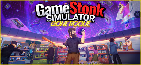
Gamestonk is the first roguelite shop simulator. Manage the last videogame store in town, keep up with the latest releases, trade smuggled retros, select your modifiers strategically, hire workers, and deal with pesky shoplifters.
$13.49Very Positive(103)
SimulationManagementRoguelite
simsumMay 21, 2026