Scoring genre clarity...
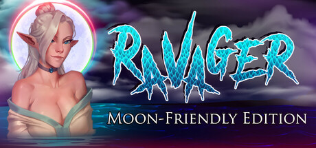
Ravager - Moon-Friendly Edition is a role-playing game where you play a young dragon, determined to reclaim his birthright. To do so, you will need to build your power, ally with dark forces, evade justice, and return to rule.
$19.994 user reviews
Early AccessDragonsDating Sim
4MinuteWarningJul 28, 2025