Scoring genre clarity...
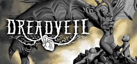
Dreadveil is an atmospheric horror shooter where you desperately scavenge for resources while avoiding terrible monsters. Balance scarce resources to solve one of many issues. Make short-term decisions to solve a more pressing problem which will then come back and bite you in the future.
$13.991 user reviews
IndieAtmosphericHorror
Inkarian DesignsSep 19, 2025