Scoring genre clarity...
Scoring genre clarity...
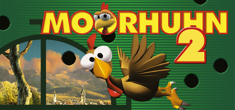
Moorhuhn 2 scores 88/100 — better than 99% of Action capsules (n=9,072).
Positive (30 reviews) · $4.99 · Released Nov 4, 2025 · By Higgs Games GmbH
Moorhuhn 2 scored 88/100 on Steam Analyzer — Excellent for a Action capsule. Top priority fix: [uniqueness_polish] Consider adding a subtle gameplay element like a target reticle or shotgun barrel hint to emphasize the hunting mechanic more explicitly.
Steam app ID: 3356350 · Tags: Action, Casual, Simulation, Sports, Arcade