Scoring genre clarity...
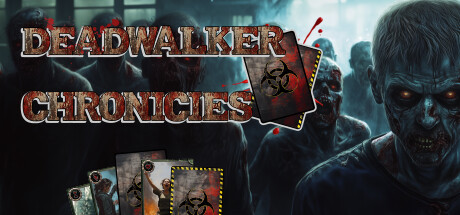
Can you survive the ultimate zombie apocalypse? Build your deck and take on a customizable Encounter Deck made from Mission, Zombie, Danger, and Location cards. Every choice matters as you face relentless threats in a collapsing world. Adapt, strategize, and prove your survival instincts!
$12.999 user reviews
DeckbuildingCard GameZombies
Black Phoenix StudioMay 28, 2025