Scoring genre clarity...
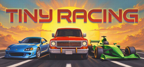
A nostalgic top-down racing game with vibrant pixel art. Choose from unique vehicles, conquer constrasting tracks, and master different modes. With intuitive arcade controls, experience high-speed excitement and become the ultimate racing champion in this retro race adventure!
$5.99Positive(13)
RacingSportsDriving
171DevJun 5, 2025