Scoring genre clarity...

Cook or Be Cooked: Your next meal could be your last—or your true love capsule

Cook or Be Cooked: Your next meal could be your last—or your true love

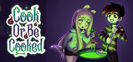
A walk-and-talk indie adventure game where you and your dysfunctional witch parents cook teens to stay young and powerful. But when they bring in a charming girl as your next meal, will you uphold the family tradition or risk everything to save her?

$4.991 user reviews
CuteInteractive FictionVisual Novel
FunigamiOct 22, 2025

Cook or Be Cooked: Your next meal could be your last—or your true love scores 72/100 — better than 37% of Cute capsules (n=4,529).

1 user reviews · $4.99 · Released Oct 22, 2025 · By Funigami

Quick text summary

Cook or Be Cooked: Your next meal could be your last—or your true love scored 72/100 on Steam Analyzer — Good for a Cute capsule. Top priority fix: [genre_clarity] Add a visual narrative element that hints at the choice mechanic—such as the charming girl character present in the scene, or a subtle split-screen effect showing both love interest and family to communicate the core conflict.

Capsule scores by dimension

  • Genre Clarity: 7/10 — Dark comedy adventure with supernatural tone. The capsule clearly signals indie adventure through the stylized character art, witch aesthetic with the green-skinned characters, and magical cauldron element in the center. The cartoon art style and playful character poses hint at narrative-driven adventure rather than action-combat focus. However, at TINY size the specific genre blend (romantic choice-driven narrative) is not immediately apparent—it reads as generic spooky adventure without the unique hook of the family cooking mechanic being visually obvious.
  • Title Readability: 8/10 — Clear neon-style title with good separation. The title 'COOK or BE COOKED' uses a bright turquoise neon outline that contrasts sharply against the dark purple background, making it highly legible at both FULL and SMALL sizes. The ornate decorative frame around the text adds personality without obscuring readability. At TINY size the title remains identifiable, though the decorative swashes become less precise—the core wordmark still reads cleanly due to the thick outline and bright color choice.
  • Contrast & Color: 8/10 — Strong value separation with vibrant accent colors. The bright turquoise neon title pops decisively against the dark purple gradient background, and the lime green witch characters create excellent silhouette clarity and color separation from the background. The purple-to-blue background gradient provides depth without competing for attention. In grayscale, the lime-green elements and white title maintain strong value separation from the mid-tone purple, ensuring the design reads clearly even without color reliance.
  • Uniqueness & Polish: 7/10 — Stylized character art with memorable witch aesthetic. The hand-drawn character illustration style is cohesive and distinctive, with expressive facial features and a clear art direction that communicates 'indie with personality.' The witchy family dynamic and cauldron setup tell a story beyond generic fantasy. However, the composition feels somewhat template-like for an indie adventure capsule—bright neon title + character art + dark background is a familiar formula seen in many indie games, so while the execution is polished, the overall concept lacks standout visual innovation compared to top performers like DAVE THE DIVER or Slay the Princess.
  • Brand Consistency: 6/10 — Coherent character style with limited identity system. The two witch characters maintain consistent cartoon rendering, expressive style, and a cohesive green skin tone and clothing palette that suggests these are recognizable recurring characters. The neon title treatment could serve as a signature brand element. Without access to the 5 store screenshots, the internal evidence shows competent consistency between the two characters, but there are no distinctive brand motifs (icons, symbols, unique visual patterns) that would make this capsule immediately recognizable as 'Cook or Be Cooked' rather than a generic witchy adventure.
  • Composition: 7/10 — Well-balanced character focal point with clear hierarchy. The two witch characters occupy the right two-thirds of the frame as the primary focal point, drawing the eye immediately, while the title sits in the upper left with strong visual weight from the neon treatment. The cauldron in the center-bottom provides secondary interest and narrative grounding. At SMALL and TINY sizes the composition holds up well—the characters remain the clear subject and the title is legible. However, the left side of the composition is relatively empty and the character positioning could be slightly more dynamic; the symmetric stance of both characters lacks depth layering between foreground and background.

What works

  • High-contrast neon title treatment. The turquoise outline neon text stands out sharply against the dark purple background and remains readable even at TINY size due to the thick stroke and bright hue.
  • Distinctive character art style. The hand-drawn witch characters with expressive faces and lime-green coloring create a memorable visual identity that signals indie adventure with personality.
  • Strong color separation and silhouettes. Green characters and turquoise title maintain excellent value contrast and edge clarity in grayscale, ensuring readability across all viewing sizes.

What hurts the capsule

  • Generic indie adventure formula. The layout of neon title + stylized characters + dark background mirrors many indie adventure capsules, limiting distinctiveness compared to top-tier competitors.
  • Unclear unique selling point at glance. The core game hook (choosing to save vs. cook your crush) is not visually communicated—the capsule reads as 'witchy adventure' rather than 'dark romantic choice-driven narrative.'
  • Left-side composition dead space. The upper left area above and beside the title contains empty purple gradient with no supporting visual interest, creating asymmetrical and slightly imbalanced framing.

Priority fixes

  1. [genre_clarity] Add a visual narrative element that hints at the choice mechanic—such as the charming girl character present in the scene, or a subtle split-screen effect showing both love interest and family to communicate the core conflict.
  2. [uniqueness_polish] Introduce a signature brand motif or symbol (e.g., a distinctive cauldron icon, cooking-themed border, or glyph system) that could serve as a recognizable identity cue across marketing materials.
  3. [composition] Rebalance the left-side space by adding supporting visual interest such as spell effects, ingredient elements, or a secondary character to create depth layering and reduce empty real estate.

Store copy priority fixes

  1. [feature_communication] Replace the Harry Potter aesthetic bullet with a specific mechanical feature, such as 'Navigate multiple branching story paths where your cooking decisions determine character survival' to clarify actual gameplay.
  2. [audience_targeting] Add an explicit sentence targeting the core audience, such as 'Perfect for players seeking dark, choice-driven narratives with real moral consequences and dark humor' to signal who should buy this game.
  3. [genre_clarity] Clarify what 'walk-and-talk' gameplay means mechanically in the detailed description—are there real-time exploration segments, or is it a menu-driven visual novel with descriptive flavor text?

Related guides

Steam app ID: 3360990 · Tags: Cute, Interactive Fiction, Visual Novel, Text-Based, Magic