Doomsday Tower Defense scores 75/100 — better than 70% of Action capsules (n=8,534).

Quick text summary

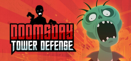
Doomsday Tower Defense scored 75/100 on Steam Analyzer — Good for a Action capsule. Top priority fix: [uniqueness_polish] Add visual storytelling element that hints at tower defense mechanics—such as subtle tower silhouettes, defensive fortification, or environmental context that differentiates from generic zombie games.

Capsule scores by dimension

  • Genre Clarity: 8/10 — Clear tower defense zombie theme. The animated green zombie character with exaggerated features and the bold 'DOOMSDAY TOWER DEFENSE' title immediately signal action tower defense gameplay. The zombie silhouette reads distinctly at tiny size, and the apocalyptic orange-red gradient reinforces the doomsday survival theme. Genre is unambiguous and thematically cohesive across all viewing sizes.
  • Title Readability: 8/10 — Bold, legible title with strong contrast. The two-line layout with 'DOOMSDAY' in black outline on red and 'TOWER DEFENSE' in white block lettering provides excellent separation and readability. Text remains clear at small capsule size and maintains legibility even at tiny thumbnail scales due to generous letter spacing and high contrast. The structured layout prevents collapse and ensures the core game identity survives quick-scroll viewing.
  • Contrast & Color: 8/10 — Vibrant warm palette with clean separation. The warm orange-red gradient background creates strong value separation against the Steam dark theme (#1b2838), while the green zombie pops vividly through saturation contrast and bright eye highlights. Black silhouette of the zombie on the left anchors the composition and reads clearly in grayscale, with the bright white eyes maintaining focal attention at every size.
  • Uniqueness & Polish: 7/10 — Solid casual style, generic execution. The cartoonish zombie character design and comic-book-style effects (action lines, explosion gradient) convey personality and match the casual tower defense positioning. However, the overall aesthetic feels like competent but familiar indie game presentation without a distinctive visual hook that sets it apart from other tower defense or zombie casual titles. The craft is clean but not particularly memorable or premium-feeling.
  • Brand Consistency: 6/10 — Functional theme, limited identity markers. The green zombie character and doomsday color scheme are thematically consistent and would be recognizable if repeated across marketing materials. However, there are no distinctive brand symbols, signature visual motifs, or unique rendering style that would create strong recall against competitor tower defense games. The identity is coherent but generic within the casual strategy space.
  • Composition: 8/10 — Clear hierarchy, balanced focal points. The left-side zombie character anchors visual attention with its large silhouette and bright white eyes, while the title occupies the left-center without crowding edges or competing with the character. The composition uses depth effectively with the background gradient creating atmospheric backdrop separation. Safe margins are respected and the design remains legible when cropped to small or tiny formats without losing key elements.

What works

  • Strong genre signaling. Zombie silhouette and 'DOOMSDAY TOWER DEFENSE' text immediately communicate tower defense gameplay with apocalyptic theme.
  • Excellent color contrast and pop. Warm orange-red gradient and vibrant green zombie create visual separation against Steam dark background, maintaining clarity at all sizes.
  • Readable title layout. Two-line structure with black outline and white lettering ensures text remains legible even at tiny thumbnail size.
  • Well-balanced composition. Character on left, title on left-center creates clear focal hierarchy without dead space or awkward cropping vulnerabilities.

What hurts the capsule

  • Generic visual identity. Cartoonish zombie and standard action-gradient design lack distinctive brand markers or memorable visual hooks compared to top-tier casual titles.
  • Limited visual storytelling. Capsule shows a single zombie character without suggesting core tower defense mechanics, strategy layers, or what makes this game unique among tower defense options.
  • Predictable art direction. Comic-book effects and warm gradient feel like familiar indie game templates rather than premium or distinctive creative vision.

Priority fixes

  1. [uniqueness_polish] Add visual storytelling element that hints at tower defense mechanics—such as subtle tower silhouettes, defensive fortification, or environmental context that differentiates from generic zombie games.
  2. [brand_consistency] Develop a signature visual motif or icon (e.g., distinct tower design, doomsday symbol, or character trait) that could serve as recognizable brand identity across store screenshots and marketing.
  3. [contrast_color] Test zombie character in grayscale and at tiny size to confirm eye highlights and silhouette maintain sufficient separation without relying on color saturation alone.

Store copy priority fixes

  1. [uniqueness] Add 2–3 concrete examples of towers and their specialized roles (e.g., 'gunner towers for fast zombies, freeze towers to slow horde waves, splash-damage mortars for grouped enemies').
  2. [audience_targeting] Clarify who this is for by adding a sentence like 'Perfect for strategy fans seeking tight, no-fluff gameplay' or 'Family-friendly difficulty balancing' depending on intent.
  3. [feature_communication] Expand the upgrade system description—specify whether upgrades are permanent, temporary, or tower-specific to show strategic depth.
  4. [uniqueness] Strengthen the scope positioning by adding 'Designed for quick sessions' or 'Master all 20 levels in one sitting' to emphasize the 2–3 hour completability as a design choice, not a limitation.

Related guides

Steam app ID: 3365120 · Tags: Action, Casual, Simulation, Strategy, Arcade