Scoring genre clarity...

Synthwave Driver capsule

Synthwave Driver

A nostalgic road trip on an endless highway, driving iconic '80s cars through a neon-filled paradise. Let the synthwave soundtrack guide you toward the horizon, leading you into a world of nostalgic vibes.

$2.99Very Positive(98)
Early AccessRacing1980s
Runebox StudiosMay 20, 2025

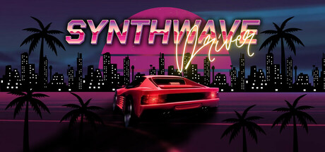
Synthwave Driver scores 87/100 — better than 99% of Early Access capsules (n=3,067).

Very Positive (98 reviews) · $2.99 · Released May 20, 2025 · By Runebox Studios

Quick text summary

Synthwave Driver scored 87/100 on Steam Analyzer — Excellent for a Early Access capsule. Top priority fix: [title_readability] Ensure title letterforms maintain stroke weight and clarity when scaled below 100 pixels wide by testing at 120×45 actual pixel display.

Capsule scores by dimension

  • Genre Clarity: 9/10 — Synthwave racing instantly recognizable. The neon-soaked '80s aesthetic, iconic red sports car centered in the frame, palm tree silhouettes, and glowing pink sun create unmistakable synthwave racing imagery. At tiny size, the combination of the car silhouette, neon glow, and palm trees immediately communicates both the genre and the nostalgic aesthetic without ambiguity.
  • Title Readability: 8/10 — Bold neon text with minor compression. The 'SYNTHWAVE' title uses thick, bright pink neon lettering with strong contrast against the dark sky, and 'MANIA' in yellow maintains readability. The layered glow effect supports legibility at full size, though at tiny size the letter spacing compresses slightly and the effect thickness could cause minor blur, but the bold form still reads clearly enough for identification.
  • Contrast & Color: 9/10 — Vibrant neon pops against dark background. The bright magenta title, electric cyan horizon line, and glowing red car create strong value separation against the dark purple-blue sky and near-black buildings. The silhouettes of palm trees and cityscape remain crisp and distinct in grayscale, and the neon glow provides luminous contrast that persists even at tiny thumbnail size during quick scroll.
  • Uniqueness & Polish: 9/10 — Premium synthwave aesthetic, cohesive execution. The capsule demonstrates polished craft with intentional color grading (warm neon accents against cool dark backdrop), professional glow effects on the title and car, and a distinctive visual hook that communicates the core experience. The layered composition and saturated palette feel premium rather than generic template work, standing apart from typical racing capsules with a clear art direction unique to the synthwave subgenre.
  • Brand Consistency: 8/10 — Strong synthwave identity, iconic motifs. The capsule establishes a recognizable brand identity through consistent use of neon pink and cyan, the iconic '80s car as a signature visual, and the palm tree and sun motifs that define synthwave aesthetics. The color palette and retrowave styling create memorable identity cues that would be recognizable across marketing materials, though some variation may exist across the 16 store screenshots.
  • Composition: 9/10 — Balanced focal point, strategic layering. The red car sits as a clear primary focal point in the center-lower frame with supporting elements (sun, title, cityscape) creating visual hierarchy without competing for attention. The background-midground-foreground layering (buildings, palm trees, sun, car, text) creates depth that reads well even at tiny size, and the safe margins keep all critical elements away from dangerous crop edges.

What works

  • Iconic genre recognition at tiny size. The synthwave aesthetic with car, palms, and neon instantly communicates racing and '80s nostalgia even as a 120×45 thumbnail.
  • Strong neon color contrast and glow. Vibrant magenta, cyan, and red create luminous separation from the dark background that survives compression and quick scrolling.
  • Professional polish and intentional craft. Layered glow effects, graded lighting, and cohesive color palette feel premium and distinct within the racing genre.
  • Clear visual hierarchy and focal point. The centered car remains the primary subject without competing elements, supported by title and environment elements that guide the eye naturally.

What hurts the capsule

  • Title glow may blur at extreme compression. The neon text effect could lose letter definition sharpness when scaled to very small thumbnail sizes during streaming or low-bandwidth conditions.
  • Limited gameplay context beyond aesthetic. The capsule communicates style and genre but gives little visual hint of actual driving mechanics, road progression, or gameplay loop beyond a parked vehicle.

Priority fixes

  1. [title_readability] Ensure title letterforms maintain stroke weight and clarity when scaled below 100 pixels wide by testing at 120×45 actual pixel display.
  2. [composition] Consider adding a subtle road or horizon line element to hint at the 'endless highway' core mechanic while maintaining current composition balance.

Store copy priority fixes

  1. [feature_communication] Name and briefly describe the 5 game modes (e.g., 'Arcade, Time Trial, Endless Drive, Chill Mode, Competitive Racing') so players understand their gameplay options.
  2. [uniqueness] Add a concrete differentiator—either a unique mechanic (e.g., 'the only synthwave racer where you create your own soundtrack') or a specific selling point that explains why this game stands out.
  3. [genre_clarity] Clarify the Simulation tag: either explain what sim elements exist (realistic physics, damage, fuel?) or remove/reframe the tag to match the casual, chill-focused copy.
  4. [hook_strength] Replace the repeated opening with a distinct short description that leads with a core gameplay verb or unique hook instead of restating the detailed description.

Related guides

Steam app ID: 3365470 · Tags: Early Access, Racing, 1980s, 1990's, Old School