Scoring genre clarity...
Scoring genre clarity...
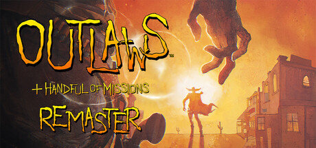
Outlaws + Handful of Missions: Remaster scores 70/100 — better than 34% of Boomer Shooter capsules (n=271).
Very Positive (16 reviews) · $20.99 · Released Nov 20, 2025 · By LucasArts
Outlaws + Handful of Missions: Remaster scored 70/100 on Steam Analyzer — Good for a Boomer Shooter capsule. Top priority fix: [uniqueness_polish] Introduce a distinctive visual motif or character silhouette (e.g., emphasize protagonist's unique pose or a signature weapon/symbol) that would remain recognizable at SMALL size and differentiate from generic Western covers.
Steam app ID: 3366780 · Tags: Boomer Shooter, Western, FPS, Action, Shoot 'Em Up