Pickscover 2 scores 62/100 — better than 2% of Early Access capsules (n=3,067).

Quick text summary

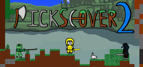
Pickscover 2 scored 62/100 on Steam Analyzer — Solid for a Early Access capsule. Top priority fix: [title_readability] Simplify or enlarge the title letterforms and remove or minimize decorative pickaxe elements to ensure legibility at small and tiny sizes without loss of character.

Capsule scores by dimension

  • Genre Clarity: 7/10 — Retro action-adventure clearly readable. The pixel art style, character silhouettes, enemies, and platforming environment immediately signal a 2D action game with light RPG elements. At tiny size, the yellow protagonist figure and enemy diversity remain visible, though specific RPG mechanics like skill trees are not visually apparent from the scene alone. The retro aesthetic aligns well with indie action-adventure expectations and genre recognition is strong.
  • Title Readability: 5/10 — Title readable at full but struggles at tiny. At full size, 'PICKSCOVER 2' is legible with the outlined letterforms and moderate spacing, though the decorative pickaxe motifs in the letters add some visual noise. At small and tiny sizes, the title becomes difficult to parse cleanly due to the decorative font treatment and the narrow letter spacing compressing further. The outline stroke helps contrast against the background but does not fully compensate for legibility loss at reduced scales.
  • Contrast & Color: 6/10 — Adequate value separation with pixel constraints. The scene uses bright greens, blues, and warm earth tones that separate from the dark Steam background, but the mid-tone gray sky and terrain reduce overall punch. The yellow protagonist stands out clearly, and the enemy silhouettes on the right read well, but the overall palette is somewhat muted for a 2D action title. At tiny size, color separation remains functional but lacks the saturation or stark contrast of premium action game capsules.
  • Uniqueness & Polish: 6/10 — Competent retro style, generic composition. The pixel art execution is clean and shows craft, with consistent sprite work and environment detail, but the scene is a standard side-scrolling action setup with no distinctive hook or unique visual storytelling. No single element—character design, mechanic hint, or environment detail—stands out as memorable or differentiating from typical indie pixel platformers. The presentation is solid baseline work without a clear premium or standout identity.
  • Brand Consistency: 6/10 — Consistent art style, limited brand identity. The pixel art rendering, palette, and sprite quality are internally coherent across all visible elements, showing consistent technical execution. However, there is no iconic character, memorable motif, or distinctive visual hook that would signal 'Pickscover' specifically or make the game recognizable in future promotional materials. The retro style is appropriate but generic within the crowded indie pixel art space.
  • Composition: 7/10 — Clear focal point, good depth layering. The yellow protagonist is positioned as a clear primary focal point in the center-right area, with supporting enemies and environmental features guiding the eye. Background, midground, and foreground layers create readable depth, with the sky, terrain, and foreground objects establishing a coherent hierarchy. At small and tiny sizes, the protagonist and enemy silhouettes remain the clear primary subjects, though the title at the top competes slightly for attention in the compositional balance.

What works

  • Clear primary subject and focal point. The yellow protagonist character is positioned prominently and reads clearly at all sizes, ensuring the player understands the core perspective and action focus immediately.
  • Consistent pixel art execution. Sprite work, environment detail, and rendering style are uniform throughout, demonstrating solid craft and technical competence in the retro aesthetic.
  • Readable depth and layering. Background, midground, and foreground separation creates visual structure and guides the eye through the scene without clutter.

What hurts the capsule

  • Title legibility collapses at small sizes. The decorative font treatment with pickaxe motifs and modest stroke width lose clarity when compressed, making the game name difficult to identify at thumbnail scales.
  • Generic scene composition and no visual hook. The side-scrolling action setup is standard fare for indie pixel platformers with no unique mechanic hint, distinctive character pose, or environment detail that communicates a specific selling point.
  • Muted overall color contrast against dark background. The gray sky and muted terrain tones reduce visual pop against the Steam dark background, relying primarily on the yellow protagonist to carry contrast appeal.
  • No memorable brand identity signals. No iconic character design, signature motif, or distinctive visual element exists that would make the game recognizable or instantly recall the 'Pickscover' brand in future materials.

Priority fixes

  1. [title_readability] Simplify or enlarge the title letterforms and remove or minimize decorative pickaxe elements to ensure legibility at small and tiny sizes without loss of character.
  2. [contrast_color] Increase sky saturation or replace gray with a brighter contrasting hue (e.g., deeper blue or warm gold) to lift overall visual pop against the #1b2838 Steam background.
  3. [uniqueness_polish] Add a distinctive visual hook or signature element to the scene—such as an iconic enemy, skill tree UI hint, or unique environment feature—that signals the game's specific identity and RPG sandbox nature.
  4. [title_readability] Add a subtle outline or shadow to the title to ensure it reads clearly over background detail without competing with the protagonist focal point.

Store copy priority fixes

  1. [uniqueness] Add 1–2 sentences explaining what makes Pickscover 2 different from other action RPG sandboxes—e.g., 'The only game where terrain destruction directly determines your progression path' or 'Combines dark fantasy boss progression with peaceful sandbox building' or comparative detail.
  2. [feature_communication] Replace vague 'world-shaping' language with concrete mechanics: 'Dig caves, build bases, and terraform the landscape to reveal hidden dungeons and create shortcuts to boss arenas' to show gameplay impact.
  3. [hook_strength] Rewrite the opening line to lead with a unique emotional or mechanical hook rather than generic setup—e.g., 'Reshape a corrupted world brick by brick: mine for power, craft legendary weapons, and face the bosses that destroyed it' to create urgency and specificity.
  4. [tone_match] Remove or soften all-caps section headers (change 'Fend off Tons of Enemies' to 'Countless Enemies with Unique Abilities') and replace marketing filler ('tons of,' 'unique') with precise descriptors ('50+ enemy types,' 'procedurally varied') to match indie/casual tone.

Related guides

Steam app ID: 3368880 · Tags: Early Access, Action RPG, Exploration, 2D Platformer, Sandbox