Quick text summary
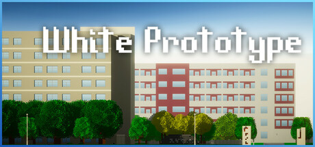
White Prototype scored 65/100 on Steam Analyzer — Solid for a Exploration capsule. Top priority fix: [uniqueness_polish] Introduce a distinctive visual element such as a recognizable character, development studio logo, or stylized art filter that reflects the game dev theme and creates memorable brand identity.
Capsule scores by dimension
- Genre Clarity: 7/10 — Campus life simulation clearly signaled. The architectural setting with multiple residential buildings and green campus environment immediately communicates a life simulation or student-focused game. At TINY size, the building silhouettes and dense urban campus layout remain recognizable as a school or university setting, though the Game Development Club focus is not visually apparent. The genre reads as slice-of-life simulation effectively, though narrative specifics are lost at smaller sizes.
- Title Readability: 7/10 — Title legible at all sizes. The white sans-serif title 'White Prototype' uses strong contrast against the mid-tone building backgrounds and sky, with clean letterforms and adequate letter spacing. At FULL size it is crisp and readable; at SMALL size it remains clear; at TINY size the text compresses but remains distinguishable due to the weight and color separation. The simple, geometric font choice supports legibility across scales better than decorative alternatives.
- Contrast & Color: 7/10 — Good value separation against dark background. The warm beige and cream building palette combined with bright white title text contrasts effectively against the Steam dark background #1b2838, especially the sky gradient which reads as light and airy. The green vegetation provides warm-cool color separation that aids silhouette clarity at SMALL size. In grayscale evaluation, the mid-to-light value range of buildings reads distinctly from dark background, though the overall palette sits in a compressed mid-tone range that could be pushed further.
- Uniqueness & Polish: 6/10 — Competent but aesthetically generic campus. The capsule presents a clean, functional illustration of a university campus with adequate rendering quality and lighting consistency, but the art direction lacks distinctive character or memorable visual hooks. The scene feels like a straightforward architectural visualization rather than communicating the game's core appeal around game development or student life story beats. When compared to top performers like Minami Lane or Tiny Glade which have distinctive art styles, this reads as serviceable but unpolished.
- Brand Consistency: 5/10 — Generic campus lacking identity cues. The capsule presents no recognizable character, mascot, icon, or signature visual motif that would help players identify White Prototype across marketing materials or store pages. The architectural rendering style is competent but interchangeable with many other student-life or campus-set games, offering no internal cohesion signals that suggest a distinctive brand identity. Without access to other store assets, the campus itself could serve as an identity anchor if it were more visually distinctive or stylized.
- Composition: 7/10 — Well-balanced with clear focal region. The composition uses a clear horizontal layering of sky (top), buildings (center), and vegetation (bottom) that creates natural depth and guides attention to the campus setting. The title sits in the upper-left to center region with adequate breathing room from edges, and no critical elements appear endangered by Steam's typical crop margins. At SMALL size the composition remains stable with the buildings anchoring focus centrally; at TINY size the scene compresses well enough to remain legible, though individual building details blur into architectural mass.
What works
- Title contrast and readability. White sans-serif text maintains clarity across all viewing sizes against both sky and building backgrounds due to strong value separation and clean letterforms.
- Architectural composition clarity. Horizontal layering of sky, buildings, and ground vegetation creates intuitive depth and compositional balance that remains stable when scaled down to TINY size.
- Campus setting communicates genre. The multi-building residential layout and green campus environment immediately signal a student life or simulation game to viewers in the target audience.
What hurts the capsule
- Generic visual identity. The scene lacks distinctive art style, character presence, or memorable visual motifs that would differentiate this from other campus-set games or help build brand recognition.
- Gameplay focus not visually communicated. The Game Development Club premise and core gameplay loop are not hinted at visually; the capsule reads as generic campus exploration rather than game dev-specific narrative.
- Compressed mid-tone palette. Building colors and warm sky occupy a similar value range, reducing visual pop against the dark Steam background compared to capsules with stronger light-dark separation.
Priority fixes
- [uniqueness_polish] Introduce a distinctive visual element such as a recognizable character, development studio logo, or stylized art filter that reflects the game dev theme and creates memorable brand identity.
- [genre_clarity] Add subtle visual hints of game development (code editor window, game controller, design elements) visible in one of the buildings or campus spaces to clarify the core gameplay hook.
- [contrast_color] Increase the luminance contrast by brightening the sky gradient or darkening building shadows to push the value separation further from mid-tone compression.
- [title_readability] Consider a subtle outline or drop shadow on the title to ensure maximum legibility at TINY size when the image is scrolled quickly on Steam.
Store copy priority fixes
- [hook_strength] Rewrite the opening line to lead with a specific emotional hook or choice: e.g., 'Shape your future through decisions: will you become a celebrated game designer, or chart a different path?' Instead of 'Freely explore.'
- [feature_communication] Replace vague phrases with concrete mechanics: specify how 'gathering inspiration' works (photograph moments? dialogue choices?), what 'completing projects' entails (turn-based dev? real-time collaboration?), and how money management affects progression.
- [uniqueness] Add a specific differentiator: articulate what makes this campus or dev club story distinct (e.g., 'the only game where your creative choices in club projects affect your relationships and graduation outcome,' or 'uncover the campus's hidden history through exploration').
- [tone_match] Warm up the formal language to match the 'Relaxing' and 'Atmospheric' tags: replace 'navigate campus survival' with more human, inviting language that emphasizes discovery and connection over challenge.
Related guides
Steam app ID: 3373480 · Tags: Exploration, Atmospheric, Life Sim, Indie, First-Person