Scoring genre clarity...
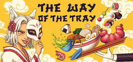
The Way of the Tray is a waiter simulator with action puzzle elements in a Japanese spirit world setting. Your task is to master the skill of serving dishes and earn the trust of yokai patrons. Will you be able to prove yourself and find your way home?
$9.99Mostly Positive(59)
CookingSimulationPixel Graphics
Who is Terry?Aug 25, 2025