Pachinko TD scores 68/100 — better than 18% of Strategy capsules (n=5,103).

Quick text summary

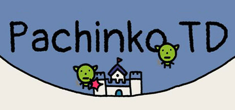
Pachinko TD scored 68/100 on Steam Analyzer — Solid for a Strategy capsule. Top priority fix: [genre_clarity] Add a visual pachinko ball or physics trajectory line near the creatures or castle to immediately communicate the hybrid tower defense-pachinko mechanic at tiny size.

Capsule scores by dimension

  • Genre Clarity: 7/10 — Tower defense with physics elements clear. The castle structure in the center and green enemy-like creatures establish a tower defense context. The pachinko ball mechanics are implied by the visual style and title, though physics-tower-defense hybrid is not immediately obvious at tiny size—most viewers would recognize tower defense but may miss the pachinko integration without reading the title.
  • Title Readability: 8/10 — Bold title reads well at all sizes. The large black sans-serif title 'Pachinko TD' sits prominently on the light blue upper region with strong contrast and clear letterforms. At tiny size the text remains legible, though individual characters compress slightly. The placement avoids overlap with central game elements, ensuring readability across all viewing scales.
  • Contrast & Color: 7/10 — Strong value separation with minor blend. The light blue sky background and cream-colored lower section create clear value separation from black title and green creatures. Against the Steam dark background #1b2838, the upper blue reads well, though the cream-colored bottom section loses some pop and can appear slightly washed out at tiny size. Silhouettes of the castle and creatures are distinct.
  • Uniqueness & Polish: 6/10 — Minimalist and functional, lacks standout polish. The pixel-art style and simple geometric composition are clean and appropriate for an indie casual game, but feel generic within the tower defense space. The execution is competent—clean lines, intentional color choices—but the visual presentation does not communicate a memorable unique mechanic or visual hook that distinguishes it from similar indie tower defense titles. The pachinko element, the core differentiator, is not visually emphasized.
  • Brand Consistency: 6/10 — Minimal identity cues, coherent but generic. The art style is internally consistent—flat pixel art, limited palette of blue, green, cream, and black—and feels cohesive. However, there are no distinctive brand identity signals such as a memorable character, icon, or signature visual motif that could be recognized across other marketing materials. The look is polished but could belong to many casual indie games.
  • Composition: 7/10 — Clear hierarchy with centered focal point. The castle and creatures occupy a clear focal point in the lower center, while the title anchors the top with strong visual weight. At small and tiny sizes, the composition remains readable with no competing elements. However, the composition is somewhat static and symmetrical, with unused space in the upper corners; while safe, it lacks dynamic visual interest or depth layering that would elevate the design.

What works

  • Legible title placement. Black sans-serif 'Pachinko TD' contrasts strongly against the light blue background and remains readable at tiny size without collision with game elements.
  • Clean minimalist aesthetic. Consistent pixel-art style, limited color palette, and uncluttered layout create a professional, polished appearance appropriate for casual indie games.
  • Strong central focal point. The castle and creatures draw immediate attention at all sizes, establishing clear visual hierarchy and preventing eye drift.

What hurts the capsule

  • Pachinko mechanic not visually communicated. The capsule does not visually hint at the physics-based pachinko gameplay—title alone carries the concept, limiting discoverability for players unfamiliar with the name.
  • Generic tower defense presentation. Castle and creature design feel standard within the tower defense genre, offering no distinctive visual hook or unique art direction that sets this game apart from competitors.
  • Lack of visual depth and dynamic composition. The flat, centered, symmetrical layout feels static; there is no layering, foreground-background separation, or compositional tension that would create visual interest or memorable brand presence.
  • Cream lower section lacks pop. The light cream-colored bottom portion blends somewhat against the Steam dark background and does not reinforce the capsule's visual impact at small viewing sizes.

Priority fixes

  1. [genre_clarity] Add a visual pachinko ball or physics trajectory line near the creatures or castle to immediately communicate the hybrid tower defense-pachinko mechanic at tiny size.
  2. [uniqueness_polish] Introduce a distinctive character, mascot, or signature visual motif (e.g., a stylized ball character or unique creature design) that conveys personality and stands out within the tower defense category.
  3. [contrast_color] Replace or adjust the cream-colored lower section with a darker, more saturated tone that increases value contrast against the Steam dark background and strengthens overall visual pop.
  4. [composition] Rebalance the layout to introduce diagonal or offset composition elements, add a secondary focal point, or layer depth cues (parallax or foreground elements) to increase visual dynamism and memorability.

Store copy priority fixes

  1. [hook_strength] Replace the opening line with a verb-forward hook that sells the unique appeal: 'Drop your towers onto a bouncing pachinko board and watch physics handle the defense' or similar, moving past the comp title.
  2. [uniqueness] Add 1-2 sentences explaining how pachinko physics specifically change the tower defense experience and why that matters (e.g., does tower placement interact with ball physics? are ricochet effects core to strategy?)
  3. [feature_communication] Expand 'make simple choices' into concrete examples of a single turn or round: 'Build a laser tower or upgrade your gold production, then release the enemy swarm and watch it collide with your defenses,' to clarify the play loop.
  4. [audience_targeting] Reconcile the 'Relaxing' and 'Casual' tags with the 'challenge' warning by clarifying: are difficulty options available? Does difficulty scale? Is it relaxing *to play* (controls) but challenging *to win* (strategy)?

Related guides

  • Steam page optimisationCapsule, copy, screenshots, tags — the full Steam page conversion stack.
  • Steam tags guideTag selection, ordering, and how it shapes Steam's recommendation rails.

Steam app ID: 3374070 · Tags: Strategy, Minimalist, Physics, Tower Defense, Casual