Scoring genre clarity...

Crown Of Hispania capsule

Crown Of Hispania

Rewrite the Reconquista in a grand strategy game where population, religion, and war evolve dynamically based on your decisions. Will you become a legendary ruler, or will you be rejected by those forgotten by History?

Grand StrategyStrategyMedieval
Regalis StudioAugust 2026

Crown Of Hispania scores 75/100 — better than 70% of Grand Strategy capsules (n=252).

Released August 2026 · By Regalis Studio

Quick text summary

Crown Of Hispania scored 75/100 on Steam Analyzer — Good for a Grand Strategy capsule. Top priority fix: [composition] Simplify or darken background clutter elements to ensure the character portrait and title remain the clear focal points at small thumbnail sizes.

Capsule scores by dimension

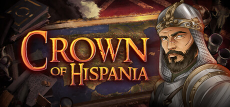
  • Genre Clarity: 8/10 — Strong historical strategy signals. The armored medieval ruler portrait, heraldic shield motif, and ornate gold title treatment immediately communicate a grand strategy game set in a historical period. At tiny size, the character silhouette and armor remain recognizable enough to suggest tactical/strategy gameplay, though the specific Reconquista theme requires prior knowledge. The visual language aligns well with strategy genre expectations.
  • Title Readability: 8/10 — Legible gold serif title. The title "CROWN OF HISPANIA" uses a bold serif font in warm gold with a distinct outline that maintains readability at small and tiny sizes against the dark blue background. The letterforms are clean and spacious, avoiding decorative collapse at reduced scales. At tiny size, the title compresses slightly but remains distinguishable, though individual letters blur slightly during quick scroll.
  • Contrast & Color: 8/10 — Warm gold pops cleanly. The gold title and character lighting create strong warm-to-cool contrast against the dark navy-blue background, with good value separation that reads well in grayscale. The character's armor and flesh tones provide mid-tone depth without muddiness, and the red banner accent in the upper right adds directional energy. At tiny size, the warm gold remains the dominant focal element with clear silhouette separation from the cool background.
  • Uniqueness & Polish: 7/10 — Polished period authentic style. The capsule demonstrates strong craft with a carefully rendered character portrait, ornate typographic treatment, and cohesive medieval aesthetic that feels intentional rather than templated. The art direction suggests a premium indie production with attention to historical authenticity. However, the composition—while solid—follows established grand strategy visual conventions (portrait + title) rather than presenting a unique mechanical hook or distinctive visual storytelling element unique to Crown of Hispania's core loop.
  • Brand Consistency: 7/10 — Consistent period aesthetic. The capsule establishes a coherent medieval Iberian visual language through armor style, gold ornamentation, and color palette (golds, deep blues, earth tones) that should carry across store assets. The bearded ruler portrait creates a memorable character anchor, though without access to the 8 store screenshots, internal consistency cannot be fully verified. The visual identity feels distinctive within strategy, though not yet iconic or instantly recognizable at glance.
  • Composition: 7/10 — Balanced portrait hierarchy. The character portrait anchors the right side while the title occupies safe left-center positioning, creating clear primary and secondary focus areas with good depth layering (background banner, midground character, title overlay). The composition reads clearly at all sizes with no critical elements at dangerous edges. At tiny size, the character and gold title remain the two dominant reads without competing scatter, though some background detail (books, objects) becomes decorative noise.

What works

  • Gold title contrast maintains clarity at tiny size. The warm gold serif lettering with outline remains readable and distinctive even when compressed to thumbnail scale against the dark blue background.
  • Character portrait establishes memorable anchor. The detailed bearded ruler in armor creates a strong focal point and potential brand identity signal that differentiates the capsule from generic strategy fare.
  • Color palette supports period authenticity. The gold, deep blue, and earth-tone combination feels intentional and historically grounded rather than arbitrary, reinforcing the Reconquista theme.
  • Safe composition margins avoid edge crop risk. Critical elements (title, character face) sit well within safe zones and will not suffer from Steam's variable cropping on different displays.

What hurts the capsule

  • Background elements create visual clutter at small sizes. The objects (books, banners, architectural elements) in the upper background add detail at full size but become visual noise that competes for attention when the capsule compresses.
  • Generic grand strategy visual trope. The portrait + title formula, while executed well, doesn't communicate what makes Crown of Hispania mechanically unique compared to other historical strategy games like Total War or Age of Wonders.
  • Red banner accent lacks visual integration. The upper right red fabric element feels like a decorative afterthought rather than a cohesive part of the composition, and its purpose in communicating game identity is unclear.

Priority fixes

  1. [composition] Simplify or darken background clutter elements to ensure the character portrait and title remain the clear focal points at small thumbnail sizes.
  2. [uniqueness_polish] Add a subtle visual indicator of the core Reconquista mechanic (e.g., layered population/religious symbols, branching paths, or territorial progression hint) to signal what differentiates this strategy game.
  3. [genre_clarity] Consider adding a small heraldic or territorial control icon in a corner to reinforce the 'rewrite history' and 'dynamic decision' themes at tiny scale.

Store copy priority fixes

  1. [hook_strength] Move the 'What You Actually Do' section to immediately follow the short description in the detailed area, removing the repetition and leading with concrete gameplay instead of administrative notes.
  2. [feature_communication] Replace vague differentiation claims ('Fully simulated population', 'Clever AI') with one concrete example per feature showing how it plays out differently than CK2/EU4 (e.g., 'Unlike EU4's static provinces, armies can flank around enemy positions in real-time, rewarding tactical positioning').
  3. [tone_match] Remove or reduce self-aware commentary about the game being 'cool', review fishing ('Give us positive reviews because...'), and internal studio jokes ('4 Superior Humans doing what Paradox Interactive can't') that create tonal whiplash; replace with consistent developer voice that is personable but not dismissive.
  4. [audience_targeting] Add one sentence explicitly stating whether this game is for hardcore sim players seeking depth or more casual historical/medieval fans, clarifying expected time investment and complexity ceiling early.

Related guides

  • Steam page optimisationCapsule, copy, screenshots, tags — the full Steam page conversion stack.
  • Steam tags guideTag selection, ordering, and how it shapes Steam's recommendation rails.

Steam app ID: 3374640 · Tags: Grand Strategy, Strategy, Medieval, Historical, Political Sim