Scoring genre clarity...
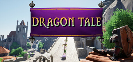
Enter DRAGON TALE, a student made Adventure Fantasy RPG where you explore a unique island and battle against grueling monsters. Interact with the townsfolk, loot exciting treasures and discover powerful weapons to help you banish the lurking evil.
Free to PlayMixed(10)
AdventureRPGExploration
Dragon Tale DevsApr 4, 2026