Scoring genre clarity...

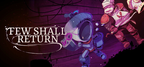
Few Shall Return capsule

Few Shall Return

Few Shall Return is a PvPvE multiplayer dungeon extraction adventure. You have to work together to survive, but you're on your own at the end of the day. Each round only takes 7.5 minutes

Early AccessMultiplayerPvP
Ballard Games2026

Few Shall Return scores 72/100 — better than 38% of Multiplayer capsules (n=3,018).

Released 2026 · By Ballard Games

Quick text summary

Few Shall Return scored 72/100 on Steam Analyzer — Good for a Multiplayer capsule. Top priority fix: [genre_clarity] Incorporate a visual cue that hints at extraction gameplay, such as a portaling effect, timer element, or team dynamics motif to differentiate from generic sci-fi action.

Capsule scores by dimension

  • Genre Clarity: 7/10 — Action-focused sci-fi extraction game. The central robotic/armored character with glowing purple accents and angular design clearly signals action gameplay, though the exact extraction/PvPvE mechanic is not immediately obvious from visuals alone. At tiny size, the silhouette reads as a sci-fi action protagonist, which aligns with the adventure and action tags, but the dungeon extraction specificity is lost. The purple glow and tech aesthetic support action-adventure positioning.
  • Title Readability: 8/10 — Clear serif title with strong contrast. The title 'FEW SHALL RETURN' uses white serif letterforms with a decorative curved underline, positioned in the upper left on a controlled dark background. At small size, the title remains clearly legible with good letter spacing and weight. At tiny size, the words compress but maintain readability due to clean stroke contrast against the dark purple. The serif choice feels intentional and premium without sacrificing clarity.
  • Contrast & Color: 8/10 — Strong purple-to-bright accent separation. The composition uses a deep purple gradient background with bright blue and magenta mechanical elements that create sharp value separation and silhouette clarity. The white title text pops cleanly against the dark field. In grayscale, the mid-tone purple and bright mechanical highlights maintain clear distinction, and the design reads distinctly even at tiny size with no muddy blending into the Steam dark background.
  • Uniqueness & Polish: 7/10 — Polished sci-fi aesthetic, moderately distinctive. The mechanical character design with glowing purple circuitry and angular construction feels well-crafted and premium, with intentional lighting and detail work. However, the sci-fi action extraction aesthetic is familiar territory among top-tier action games like Helldivers 2 and Armored Core VI, so while execution is solid, the core visual hook is not particularly distinctive. The decorative serif title treatment and curved flourish add personality and lift it above generic.
  • Brand Consistency: 6/10 — Functional tech aesthetic, limited iconic elements. The purple and blue color palette, glowing mechanical motifs, and sci-fi character design appear internally coherent and should establish a recognizable brand language across marketing materials. However, no truly iconic character, symbol, or signature motif emerges that would be instantly memorable or distinguishable from other sci-fi action titles without context. The visual identity is professional but not distinctively ownable.
  • Composition: 7/10 — Clear focal point with balanced layering. The central armored character serves as the primary focal point with the glowing mechanical elements drawing secondary attention, creating a clear visual hierarchy that works at all sizes. The title sits upper left in safe margins without edge clipping concerns. At tiny size, the bright center subject reads immediately against the gradient background. Negative space is used effectively, though the lower right corner shows some visual weight that could feel slightly bottom-heavy at full size.

What works

  • High contrast title on controlled background. White serif text with decorative underline maintains crisp readability at small and tiny sizes against the dark purple field.
  • Strong central focal point with silhouette clarity. The glowing mechanical character reads as a clear primary subject even at thumbnail scale with good value separation from the background.
  • Cohesive sci-fi aesthetic with intentional color palette. Purple-to-magenta-to-blue gradient with matching mechanical glow creates a unified, premium visual identity that avoids generic template feel.

What hurts the capsule

  • Extraction mechanic not visually communicated. The capsule reads as generic sci-fi action and does not hint at the unique PvPvE extraction hook or 7.5-minute round structure that differentiates it.
  • Limited iconic brand motif. While the mechanical design is solid, no distinctive character, symbol, or signature visual element emerges that would be instantly recognizable across future marketing touchpoints.
  • Familiar sci-fi action aesthetic. The glowing tech armor silhouette and purple lighting follow established visual patterns from major competitors like Armored Core VI and Helldivers 2, limiting originality.

Priority fixes

  1. [genre_clarity] Incorporate a visual cue that hints at extraction gameplay, such as a portaling effect, timer element, or team dynamics motif to differentiate from generic sci-fi action.
  2. [uniqueness_polish] Develop a more distinctive iconic character or motif that is memorable and ownable to Few Shall Return specifically, tested against competitor capsules.
  3. [brand_consistency] Ensure the central character design or a key symbol appears consistently across all 8 store screenshots to build stronger brand recall and internal cohesion.

Store copy priority fixes

  1. [feature_communication] Replace 'And more!' with 1-2 concrete features (e.g., 'Procedurally generated dungeons ensure no two runs are the same' and 'Cross-platform multiplayer with full controller support') to close the copy with substance.
  2. [uniqueness] Add a sentence explaining what makes the puzzle design or enemy interactions specific to the 7.5-minute format, e.g., 'Encounters scale in intensity to match your escape window' or similar design philosophy.
  3. [tone_match] Use more playful, consistent voice throughout—if 'crusader chef' and gambler abilities set the tone, lean into that personality in transitions and feature descriptions rather than shifting to formal mechanics.

Related guides

Steam app ID: 3377400 · Tags: Multiplayer, PvP, PvE, Dark Fantasy, Procedural Generation