Scoring genre clarity...

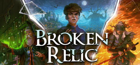
Broken Relic capsule

Broken Relic

On his first day as an archive intern, Tim unseals an ancient world-ending conqueror and is fired on the spot. Now he has to save the world. A fully voiced point-and-click comedy.

Point & ClickComedyAdventure
Sandpenguin2026

Broken Relic scores 73/100 — better than 53% of Point & Click capsules (n=1,749).

Released 2026 · By Sandpenguin

Quick text summary

Broken Relic scored 73/100 on Steam Analyzer — Good for a Point & Click capsule. Top priority fix: [genre_clarity] Add a subtle comedic or absurdist visual cue (exaggerated expression, prop, or UI element) to signal the point-and-click comedy angle and differentiate from straight fantasy adventure.

Capsule scores by dimension

  • Genre Clarity: 7/10 — Adventure game with fantasy elements clear. The capsule signals adventure through the central character, fantasy setting with magical auras (green glow left, orange fire right), and mystical artifacts. At TINY size, the character silhouette and color-coded magical zones remain readable, though the point-and-click comedy angle is not visually apparent. The fantasy adventure framing is strong, but genre specificity (indie adventure/comedic adventure) requires reading the title.
  • Title Readability: 8/10 — Clear serif title with strong contrast. BROKEN RELIC uses a bold, uppercase serif font in white with subtle outline, positioned centrally across a darker midground region. The title remains legible at SMALL size and reads well even at TINY size due to the letter spacing and weight. The white-on-dark contrast is strategic and clean, though the decorative serif style has enough substance to maintain readability across all viewing sizes.
  • Contrast & Color: 8/10 — Strong value separation and silhouette clarity. The capsule demonstrates excellent contrast against the Steam dark background through bright whites (title, highlights), cool blues and greens (left side magic), and warm oranges and reds (right side fire). The character figure has clear separation from background layers, and the color blocking creates visual depth that survives grayscale testing. At TINY size, the three distinct color zones (green left, blue center, orange right) maintain silhouette integrity.
  • Uniqueness & Polish: 7/10 — Polished but familiar fantasy adventure aesthetic. The execution shows solid craft with clean lighting effects, coherent color grading, and a professional character render. However, the composition—young protagonist flanked by mystical forces with a fantasy world backdrop—follows familiar indie adventure tropes seen in games like Slay the Princess and Viewfinder. The unique comedic angle and archive-intern premise are not visually communicated, limiting distinctiveness to the visual style alone.
  • Brand Consistency: 6/10 — Functional but generic fantasy game identity. The capsule presents a cohesive internal palette (cool-warm gradient magic, grounded character, fantasy architecture) but lacks a memorable iconic motif or signature style that would be recognizable across promotional materials. The character and setting are competent but do not establish a distinctive brand identity comparable to top-performing titles with iconic visuals or character silhouettes. No unique visual hook or recurring symbol emerges that would be recognized in store listings or social sharing.
  • Composition: 8/10 — Strong focal point with layered depth. The character occupies the clear focal point in the center-left foreground, with supporting background architecture and secondary figures providing depth without competing for attention. The composition uses layering effectively: character in sharp focus, magical auras in midground, world elements receding. At SMALL size, the hierarchy remains clear; at TINY size, the character silhouette and three-color zones guide the eye naturally. Title placement is centered and well-anchored, with safe margins respected.

What works

  • Excellent contrast against dark background. White title and bright magical effects (green, blue, orange) create strong value separation that reads clearly at all sizes and survives grayscale testing.
  • Clear hierarchical composition. Central character focal point with layered background, secondary figures, and architectural elements create natural depth without visual clutter or competing elements.
  • Readable title typography. Bold serif font with generous spacing and white-on-dark placement maintains legibility across FULL, SMALL, and TINY viewing sizes without collapse.
  • Cohesive color blocking. Three distinct magical zones (green, blue, orange) create visual zones that guide eye movement and establish thematic balance across the frame.

What hurts the capsule

  • Generic fantasy adventure aesthetic. While polished, the young protagonist with mystical forces composition mirrors common indie adventure templates without communicating the unique comedic premise or archive-intern angle.
  • No distinctive visual brand identity. The capsule lacks an iconic character pose, memorable motif, or signature visual element that would be instantly recognizable across store listings or social media.
  • Comedy angle not visually apparent. The fully voiced point-and-click comedy hook is not communicated through the capsule visuals, which present a straightforward fantasy adventure tone.

Priority fixes

  1. [genre_clarity] Add a subtle comedic or absurdist visual cue (exaggerated expression, prop, or UI element) to signal the point-and-click comedy angle and differentiate from straight fantasy adventure.
  2. [uniqueness_polish] Develop a signature visual motif (character accessory, relic design, or archive-specific element) that creates immediate brand recognition and feels distinct from standard fantasy adventure capsules.
  3. [brand_consistency] Ensure secondary materials (store screenshots, community hub art) reinforce a consistent character or world identity that makes the capsule memorable and recognizable across touchpoints.

Store copy priority fixes

  1. [feature_communication] Add specific details about the full game structure: total act count, approximate playtime for Act I and full game, and whether Act II/III will be paid or free.
  2. [uniqueness] Include one sentence explicitly comparing this to modern point-and-click adventures (e.g., 'unlike recent indie adventures, Broken Relic prioritizes logical puzzle design over obtuse solutions').
  3. [audience_targeting] Clarify in the short description or opening whether this appeals more to narrative-first or puzzle-first players, since the copy emphasizes both equally.

Related guides

Steam app ID: 3384820 · Tags: Point & Click, Comedy, Adventure, Fantasy, Story Rich