Cobble: The Stone Forager scores 73/100 — better than 61% of Exploration capsules (n=4,872).

Quick text summary

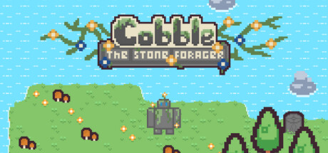
Cobble: The Stone Forager scored 73/100 on Steam Analyzer — Good for a Exploration capsule. Top priority fix: [title_readability] Increase subtitle font size or weight so 'THE STONE FORAGER' remains readable at tiny (120×45) thumbnail size without degradation.

Capsule scores by dimension

  • Genre Clarity: 8/10 — Clear casual adventure RPG. The pixel art style immediately signals indie adventure-RPG. The landscape with settlers, foraging elements (mushrooms, plants), and peaceful sky communicate relaxation and resource gathering. At tiny size, the silhouettes of NPCs and environment still read as a cozy settlement-building context, though specific mechanics become less clear.
  • Title Readability: 7/10 — Legible title with solid structure. The 'Cobble' logo is prominent and readable at full size with clear pixel lettering and tan-brown color against the dark banner. The subtitle 'THE STONE FORAGER' remains legible at small size due to the compact banner placement. At tiny size, the main logo becomes slightly soft but still recognizable; however, the subtitle begins to blur and loses definition.
  • Contrast & Color: 7/10 — Good separation with warm palette. The bright cyan sky, green grass, and tan/brown UI elements create strong value separation against the presumed dark Steam background. The warm earth tones and cool sky form a natural high-contrast pair. At tiny size, the composition still reads due to the horizontal band separation, though detail within the landscape diminishes.
  • Uniqueness & Polish: 7/10 — Charming pixel art with clear identity. The retro pixel aesthetic feels intentional and cohesive, with a warm, welcoming color palette that differentiates it from darker or more mechanically-focused sims. The scene communicates 'peaceful settlement' rather than combat or urgency. This stands apart from heavier titles in the benchmarked list, though pixel art is becoming more common; the execution is clean without feeling generic.
  • Brand Consistency: 7/10 — Consistent warm pixel aesthetic. The palette of earth tones, soft greens, and sky blue is applied uniformly. The pixel art style, character silhouettes, and NPC placement all follow a coherent visual direction that should translate across other store assets. The logo treatment and UI banner suggest a recognizable brand identity for future marketing.
  • Composition: 8/10 — Well-balanced focal hierarchy. The title banner sits prominently at the top center, drawing immediate attention without obstructing the scenic landscape below. The settlers and environment occupy the middle and lower thirds, creating natural depth and visual interest. At small size, the composition remains clear; the banner-then-scene structure holds up well, and no critical elements risk Steam cropping at standard capsule dimensions.

What works

  • Strong color harmony. The cyan-to-green-to-tan gradient creates a cohesive, warm, inviting palette that pops against dark backgrounds and reads well at all viewing sizes.
  • Clear genre signaling. The combination of settlers, foraging elements, and peaceful landscape immediately communicates casual adventure-RPG and relaxing tone without confusion.
  • Legible title placement. The banner-based title sits in a controlled, high-contrast zone that protects readability even at tiny thumbnail size.
  • Intentional pixel art style. The retro aesthetic feels purposeful and polished, creating distinction and charm compared to photorealistic or generic 3D alternatives in the genre.

What hurts the capsule

  • Subtitle loses clarity at tiny size. While 'Cobble' remains readable, 'THE STONE FORAGER' becomes soft and difficult to parse at true thumbnail resolution.
  • Limited mechanical hint. The capsule communicates theme and mood well but does not clearly show core gameplay loops such as foraging, crafting, or building mechanics that differentiate it from other settlement games.
  • Crowded NPC placement. The scattered settlers and objects create mild visual clutter that, while thematic, slightly reduces focal clarity compared to single-subject benchmarks like Tiny Glade or SUMMERHOUSE.

Priority fixes

  1. [title_readability] Increase subtitle font size or weight so 'THE STONE FORAGER' remains readable at tiny (120×45) thumbnail size without degradation.
  2. [genre_clarity] Add a subtle visual hint of a core mechanic—such as a hand reaching toward mushrooms or a building blueprint—to communicate 'foraging' or 'building' more explicitly.
  3. [composition] Slightly reduce background NPC and object density to create a clearer focal point, allowing the landscape to breathe while maintaining charm.

Store copy priority fixes

  1. [feature_communication] Replace "gathering and foraging for supplies" with 2–3 concrete examples of resources (e.g., "forage for mushrooms, chop trees for wood, mine stone") to help players visualize gameplay.
  2. [uniqueness] Add a sentence articulating what makes Cobble's story or progression unique compared to other cozy sims, or emphasize a specific mechanic that feels fresh (e.g., "rebuild Cobble's lost memory through environmental discovery").
  3. [audience_targeting] Add a brief accessibility note or playtime indicator (e.g., "perfect for unwinding—playable at your own pace") to reinforce the relaxing positioning and set expectations.
  4. [feature_communication] Include a line detailing one specific town-building output or reward so players understand the tangible impact of their gathering (e.g., "help settlers construct a homestead, farm, and lighthouse").

Related guides

Steam app ID: 3386700 · Tags: Exploration, Nature, 2D, Cute, Top-Down