Scoring genre clarity...

15 Minutes capsule

15 Minutes

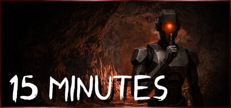
Reality shifts. Time loops. You're trapped underground with only 15 minutes and something’s changing the rules. Spot the anomalies. Find the way out before the mines turn against you or you might just run out of time. What you see may not be real.

$5.993 user reviews
CasualDarkTime Management
Construct GamesOct 23, 2025

15 Minutes scores 70/100 — better than 29% of Casual capsules (n=10,153).

3 user reviews · $5.99 · Released Oct 23, 2025 · By Construct Games

Quick text summary

15 Minutes scored 70/100 on Steam Analyzer — Good for a Casual capsule. Top priority fix: [uniqueness_polish] Introduce a visual anomaly or glitch effect (fractured/doubled elements, temporal blur) to hint at the reality-shifting core mechanic and differentiate from generic sci-fi action.

Capsule scores by dimension

  • Genre Clarity: 7/10 — Action-horror survival with sci-fi undertones. The armored figure with glowing chest piece and underground mine setting suggest sci-fi action or survival horror. At tiny size, the glowing orange elements and figure silhouette read as sci-fi/action, though the anomaly detection mechanic is not visually evident. The dark cavern and armed stance communicate danger and exploration rather than puzzle-solving or casual gameplay.
  • Title Readability: 8/10 — Clean, bold sans-serif readable across sizes. The title '15 MINUTES' uses a strong white sans-serif with excellent contrast against the dark background. At tiny size, the text remains clearly legible with good letter spacing and weight. The positioning in the lower third leaves the character focal point unobstructed while maintaining safe margins.
  • Contrast & Color: 8/10 — Strong orange and white pop against dark cave. The bright orange/amber glow on the character's chest and lamp provides excellent value separation from the dark #1b2838 background and brown rock textures. The white title text creates maximum contrast and readability. Even in grayscale, the silhouette of the armored figure separates clearly from the shadowy environment.
  • Uniqueness & Polish: 6/10 — Competent but conventional sci-fi setup. The armored soldier in a mine is a familiar trope in action and sci-fi genres, and while the rendering is clean, it lacks a distinctive hook that communicates the unique 'reality shifts' and 'time loop' premise. The glowing chest piece suggests energy or danger but doesn't visually hint at the anomaly detection or looping mechanic that makes this game distinct from similar survival-action titles.
  • Brand Consistency: 6/10 — Generic sci-fi soldier lacks memorable identity. The character design—armored figure with glowing elements—is generic enough that it could represent multiple games in the action-sci-fi space. Without exposure to other '15 Minutes' marketing materials, there are no distinctive visual motifs or signature styling cues that would be immediately recognizable as this game's unique brand. The orange glow is the only potential signature element, but it is not distinctive enough in isolation.
  • Composition: 7/10 — Strong focal point with effective balance. The armored figure is centered as the clear primary subject with the cavern providing layered background depth. The title sits in the lower third without competing for attention, and the overall composition avoids clutter. At small and tiny sizes, the silhouette reads instantly; however, the character's position is slightly high-centered, which leaves marginal safe space at the bottom where the title sits.

What works

  • Excellent title contrast and legibility. Bold white text on dark background remains crisp and readable even at tiny thumbnail size with strong visual hierarchy.
  • Clear focal point and silhouette. The armored character's glowing elements and distinct outline create an instant visual anchor that communicates sci-fi action at any size.
  • Effective value separation from background. Orange and white elements pop convincingly against the dark cave environment, maintaining clarity even during quick scroll.

What hurts the capsule

  • Generic character design lacks differentiation. The armored soldier archetype does not visually distinguish this game from dozens of similar sci-fi-action titles in the genre.
  • Core mechanic not visually communicated. The anomaly detection and time-loop premise are not hinted at through visual storytelling; the capsule reads as standard survival-action rather than reality-bending puzzle game.
  • Limited memorable brand identity. No distinctive character pose, palette, symbol, or art direction cue that would be recognizable as this specific game's signature visual identity.

Priority fixes

  1. [uniqueness_polish] Introduce a visual anomaly or glitch effect (fractured/doubled elements, temporal blur) to hint at the reality-shifting core mechanic and differentiate from generic sci-fi action.
  2. [brand_consistency] Develop a signature visual element such as a distinctive helmet design, unique color accent, or repeating motif that can anchor brand recognition across all marketing materials.
  3. [genre_clarity] Add subtle UI or environmental cues (timer elements, fractured cave sections, or phase-shift visual artifacts) that hint at the time-loop and anomaly detection gameplay without cluttering the composition.

Store copy priority fixes

  1. [feature_communication] Add a sentence explaining the core interaction verb: 'Scan corridors for anomalies' or 'Mark environmental inconsistencies' to clarify how players actually engage with the game.
  2. [audience_targeting] Explicitly state whether this is for mature horror fans or casual players—clarify the tone and intensity level to resolve the Family Sharing tag contradiction.
  3. [uniqueness] Add a concrete sentence differentiating this game: e.g., 'Unlike traditional hidden-object games, every anomaly you miss changes the environment further' or specify what makes the loop mechanic unique.
  4. [genre_clarity] Reduce the vague 'walking simulator' language and emphasize either investigation, puzzle-solving, or exploration as the dominant gameplay verb.

Related guides

Steam app ID: 3387100 · Tags: Casual, Dark, Time Management, Immersive Sim, Hidden Object