LightQb scores 73/100 — better than 64% of First-Person capsules (n=4,391).

Quick text summary

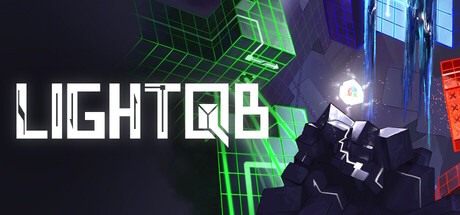
LightQb scored 73/100 on Steam Analyzer — Good for a First-Person capsule. Top priority fix: [genre_clarity] Add a subtle visual cue—such as a player character silhouette or a dynamic dash-trail effect—to clarify the movement-based survival mechanic at TINY size.

Capsule scores by dimension

  • Genre Clarity: 7/10 — Cyber action puzzle game clear. The neon grid aesthetic, geometric cubes, and glowing lasers strongly signal a sci-fi action or puzzle-action game with modern digital themes. At TINY size, the green grid cubes and bright geometric forms remain recognizable as cyberpunk/puzzle-action visuals, though the specific 'dash and dodge' mechanic is not immediately obvious without the description context. The silhouette reads as tech-forward indie action rather than generic action.
  • Title Readability: 8/10 — Bold white title excellent contrast. LIGHTQB is rendered in thick white sans-serif lettering with a green accent block in the Q, positioned in the upper-left portion with ample breathing room against the dark background. The title remains legible at SMALL size and even at TINY the letter forms hold their shape due to the weight and contrast. The integrated green cube icon reinforces the brand identity without compromising readability.
  • Contrast & Color: 8/10 — Strong neon pop against dark. Bright electric green, blue, and red neon elements create sharp value separation against the near-black dark background (#1b2838 equivalent). The glowing cube structures and laser elements read clearly in silhouette even at small sizes, with the white title adding maximum contrast. In grayscale, the light cubes and bright center focal point maintain clear distinction from the shadow regions, supporting quick visual parsing.
  • Uniqueness & Polish: 7/10 — Distinctive neon puzzle aesthetic. The capsule conveys a specific visual identity—neon-grid cyberpunk puzzle-action—that feels intentional and cohesive rather than generic. The geometric cube environment, lighting effects, and color palette are well-executed and avoid template asset feel. However, neon-grid-cube aesthetics are not uncommon in indie games, so while polished, the core concept is not entirely fresh; the execution elevates it above baseline competence.
  • Brand Consistency: 7/10 — Coherent neon cube identity. The green and blue neon grid cubes, geometric lighting, and dark-with-highlights color scheme form a recognizable internal visual language that could carry across marketing materials and in-game assets. The glowing cube motif paired with the integrated Q icon creates a potential brand anchor. Without access to the 7 store screenshots, internal consistency appears strong—rendering style, palette, and thematic elements align, though deeper brand signals (character design, UI style) are not fully visible in this single capsule.
  • Composition: 7/10 — Clear focal point with balance. The capsule uses a strong left-to-center hierarchy: title on the left, bright glowing cube cluster center-right as the primary visual anchor, with architectural grid elements creating depth layering in the background. The composition avoids clutter and dead zones, with good use of the frame. At TINY size, the bright center cube cluster and white title remain the clear focal points without competition, though some fine detail in the geometric structures becomes soft.

What works

  • High-contrast title placement. White sans-serif LIGHTQB with integrated green Q icon sits cleanly against dark background and reads sharply at all sizes, including TINY.
  • Strong neon silhouette separation. Bright green and blue geometric cubes and laser elements create clear visual separation and pop effectively against the dark background in quick-scroll conditions.
  • Coherent sci-fi aesthetic. The neon-grid-cyberpunk theme is visually distinct, internally consistent, and immediately communicates a specific game tone and genre subset without ambiguity.

What hurts the capsule

  • Generic neon-grid trope. While well-executed, the neon cube puzzle aesthetic echoes many indie games and lacks a unique hook that immediately differentiates from competitors at a glance.
  • Subtle mechanical clarity. At TINY size, the capsule conveys 'neon puzzle-action' but the core 'dash and survive' loop or time-pressure mechanic is not visually evident; viewers must infer gameplay type.
  • Limited character or mascot presence. The capsule focuses on environment and light effects rather than a memorable character silhouette or mascot, reducing brand recall potential compared to top-tier indie games.

Priority fixes

  1. [genre_clarity] Add a subtle visual cue—such as a player character silhouette or a dynamic dash-trail effect—to clarify the movement-based survival mechanic at TINY size.
  2. [uniqueness_polish] Introduce a distinctive character element, signature color accent, or visual motif unique to LightQb that cannot be mistaken for a generic neon-grid game.
  3. [composition] Consider repositioning or refining the background grid structure to ensure it supports rather than competes with the focal cube cluster, especially at SMALL size where detail softens.

Store copy priority fixes

  1. [feature_communication] Replace 'each with unique mechanics' with a concrete example: 'Ice cubes slow your momentum, fire cubes boost your speed, portal cubes warp you across the map' to show players what they will actually interact with.
  2. [uniqueness] Add a differentiating statement such as 'Combine parkour precision with light-based puzzle mechanics' or explain how the taunting character mechanic directly impacts gameplay difficulty or motivation.
  3. [feature_communication] Clarify what 'Time is not on your side' means mechanistically—is there a countdown timer, time-based hazards, or a speedrun-focused scoring system that pressures the player?
  4. [audience_targeting] Specify the intended player archetype more explicitly: 'For speedrunners chasing leaderboard records' or 'For players who love punishing difficulty and tight controls' to help the right audience self-identify.

Related guides

Steam app ID: 3392840 · Tags: First-Person, 3D Platformer, Difficult, Fast-Paced, Precision Platformer