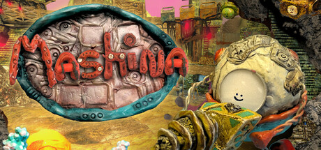
Mashina scores 70/100 — better than 28% of Strategy capsules (n=5,103).

Quick text summary

Mashina scored 70/100 on Steam Analyzer — Good for a Strategy capsule. Top priority fix: [title_readability] Add a bold outline or drop shadow to 'Mashina' text and reposition it on a semi-transparent or solid background panel to ensure legibility at tiny size

Capsule scores by dimension

  • Genre Clarity: 8/10 — Quirky indie adventure with clear charm. The stop-motion aesthetic, whimsical robot character, and colorful diorama-like environment immediately signal a unique indie adventure game. At TINY size, the distinctive crafted look and central robot figure remain recognizable, though the specific 'dig and repair' gameplay hook is not visually obvious without context. The visual language clearly avoids traditional action or strategy game tropes in favor of chill, exploratory vibes.
  • Title Readability: 4/10 — Title illegible at small sizes. The red 'Mashina' text in the upper left is difficult to parse at TINY size due to thin letterforms and placement over a busy, textured background of mechanical elements. At SMALL size it becomes slightly more readable but still struggles with contrast and fine detail loss. The title lacks a clear outline, shadow, or background isolation that would preserve legibility across all viewing conditions.
  • Contrast & Color: 7/10 — Warm palette with good tonal separation. The image uses warm oranges, yellows, and reds against darker mechanical elements and a pink-tinted sky, creating decent value separation against Steam's dark background. The stop-motion lighting with strong shadows and highlights helps the central robot and objects read clearly even at reduced sizes. Some mid-tone areas in the machinery blend together, but the overall composition maintains visual pop through strategic color placement.
  • Uniqueness & Polish: 8/10 — Distinctive stop-motion craft style. The tactile stop-motion aesthetic and hand-crafted appearance set this apart from typical indie game capsules that rely on digital rendering or flat design. The detailed diorama-like scene with layered machinery, the charming robot character with visible stitching or joints, and the intentional color grading all signal premium production values. This level of visual distinctiveness and craft coherence elevates it well above generic adventure game templates.
  • Brand Consistency: 8/10 — Consistent stop-motion world identity. The capsule establishes a clear and memorable visual identity through its use of tangible textures, warm lighting, sculptural forms, and a signature color palette of warm earth tones with vibrant accents. The robot character and mechanical environment appear cohesive with the game's core premise of a little robot in a crafted world. This aesthetic would be recognizable across store pages and marketing materials based on its distinctive approach to 3D stop-motion presentation.
  • Composition: 7/10 — Clear focal point with good layering. The robot character on the right serves as the primary focal point with a distinct silhouette, while the blue-rimmed object and mechanical elements in the upper left provide supporting visual interest without overwhelming the hierarchy. The scene has good depth layering from machinery background to midground elements to foreground character, creating visual interest at all sizes. At TINY size the central character remains the clear anchor, though the scattered machinery elements add slight visual noise to the composition.

What works

  • Distinctive visual identity. The stop-motion craft aesthetic is immediately recognizable and memorable, setting the game apart from competitor capsules through tangible texture and intentional lighting design.
  • Strong character focal point. The robot character has a clear, appealing silhouette with personality that anchors the composition and remains the dominant visual element at all sizes.
  • Warm color palette appeal. The use of warm oranges, yellows, and complementary cool accents creates visual warmth and charm that resonates with the game's chill, exploratory tone.
  • Good value separation overall. Despite some mid-tone blending, the composition maintains adequate contrast against the Steam dark background through strategic lighting and shadow work.

What hurts the capsule

  • Title text is unreadable at tiny size. The red 'Mashina' text lacks sufficient contrast, outline, or background isolation, making it illegible when the capsule is viewed as a small thumbnail.
  • Busy mechanical background. The scattered machinery elements in the upper portion compete for attention and add visual clutter that can distract from the main character at reduced sizes.
  • Title placement over texture. The title sits directly on complex mechanical detail rather than a controlled background region, compounding readability problems at all scales.
  • Gameplay hook not visually evident. While the aesthetic is clear, there are no visual cues that specifically communicate the 'dig and repair' core mechanics that define the game's unique appeal.

Priority fixes

  1. [title_readability] Add a bold outline or drop shadow to 'Mashina' text and reposition it on a semi-transparent or solid background panel to ensure legibility at tiny size
  2. [composition] Simplify or defocus the upper left machinery area to reduce visual competition and strengthen the robot character as the sole focal point
  3. [genre_clarity] Incorporate a subtle visual hint of digging or building mechanic (e.g., a shovel, excavation marks, or construction gesture) to communicate gameplay beyond aesthetic alone
  4. [title_readability] Increase text size or use a bolder, more readable typeface with better letter spacing to maintain clarity at all viewing scales

Store copy priority fixes

  1. [feature_communication] Expand the 'Build helpful machines' bullet point to explain what machines do—e.g., 'Build machines to automate mining or unlock new areas,' so the building loop becomes tangible.
  2. [genre_clarity] Add one sentence in the Gameplay section explicitly connecting building/machines to strategic problem-solving—e.g., 'Devise machine combinations to solve mining challenges and resource puzzles.'
  3. [audience_targeting] Insert a sentence after the hook clarifying target player type—e.g., 'Perfect for players seeking relaxed exploration without combat or time pressure.'

Related guides

  • Steam page optimisationCapsule, copy, screenshots, tags — the full Steam page conversion stack.
  • Steam tags guideTag selection, ordering, and how it shapes Steam's recommendation rails.

Steam app ID: 3395930 · Tags: Strategy, Puzzle, Exploration, 2.5D, 3D