Scoring genre clarity...

SlideNGlide capsule

SlideNGlide

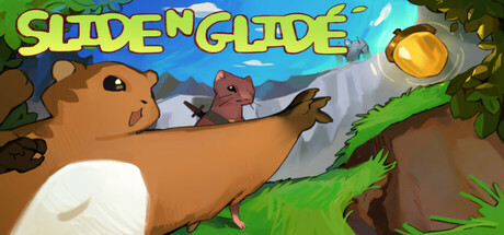
A challenging action-platformer where players navigate diverse biomes filled with unique enemies, tough platforming challenges, and intense boss fights. With tight controls and punishing difficulty, the game rewards precision, mastery, and exploration.

$3.99
ActionAdventureMetroidvania
RBCMrRhoadsMar 17, 2025

SlideNGlide scores 70/100 — better than 29% of Action capsules (n=8,534).

$3.99 · Released Mar 17, 2025 · By RBCMrRhoads

Quick text summary

SlideNGlide scored 70/100 on Steam Analyzer — Good for a Action capsule. Top priority fix: [uniqueness_polish] Introduce a distinctive visual hook—such as a signature character silhouette trait, unique particle effect, or core mechanic visualization (e.g., a motion-blur technique unique to slide momentum) that differentiates this from standard indie platformers.

Capsule scores by dimension

  • Genre Clarity: 7/10 — Clear platformer action with creature focus. The capsule immediately communicates platforming and action through the character's dynamic pose, sliding motion, and natural environment setting with platforms and vegetation. The brown creature character with expressive face and the green landscape elements signal an indie action-platformer aesthetic at full size. At tiny size, the character silhouette and movement implication remain visible, though fine details like the enemy blur slightly and genre specificity relies on the pose rather than UI elements.
  • Title Readability: 8/10 — Bold yellow title with strong contrast. SLIDE N GLIDE is rendered in large, bright yellow outlined lettering positioned prominently at the top, creating excellent contrast against the blue sky and brown character. The letterforms remain legible at small and tiny sizes due to weight and color separation. At tiny size the title reads clearly, though individual letter details compress; the all-caps styling and chunky weight maintain recognizability.
  • Contrast & Color: 8/10 — Vibrant palette with strong value separation. Bright yellows, greens, blues, and warm browns create a saturated, high-contrast palette that pops against Steam's dark background. The character's tan silhouette stands apart from the green foliage and blue sky through strong value differentiation. In grayscale, the light yellow title and brown creature separate clearly from the mid-tone environment, ensuring silhouettes read well at all sizes including tiny.
  • Uniqueness & Polish: 6/10 — Competent indie aesthetic, generic execution. The art style is clean and colorful with a cohesive cartoon-platformer look, but the scene composition—a character sliding through nature with a distant enemy—is a familiar indie platformer trope without a distinctive hook or memorable visual storytelling. The rendering quality is solid and polished, placing it above the baseline, but the concept lacks a signature mechanic visualization or unique character appeal that would distinguish it from dozens of similar indie platformers. Compared to top performers like Hades II or Sea of Stars, it reads more as competent craft than distinctive vision.
  • Brand Consistency: 6/10 — Consistent cartoony style, limited identity. The visual style is internally cohesive—consistent character rendering, uniform environment design, and a warm-cool color palette that holds together across elements. However, there are no strong iconic visual signatures, memorable character traits, or unique motifs that would make this capsule instantly recognizable as SlideNGlide in a genre-wide context. The design feels like a capable execution of a generic indie platformer template rather than a distinctive brand marker.
  • Composition: 7/10 — Clear focal point with minor edge concerns. The brown character dominating the center-left creates a clear primary focal point, with the distant enemy providing secondary interest and depth layering (foreground character, midground vegetation, background sky and enemy). The title anchors the top without competing for attention. At tiny size the focal hierarchy holds, though the right edge vegetation and enemy feel slightly cut off, potentially indicating cropping issues on Steam's carousel.

What works

  • Readable title at all sizes. The large yellow outlined SLIDE N GLIDE maintains legibility from full size through tiny thumbnail due to weight, all-caps treatment, and color contrast.
  • Vibrant, warm-cool palette. The bright yellows, greens, and blues pop strongly against the dark Steam background and create natural value separation that survives grayscale testing.
  • Dynamic character pose signals action. The sliding creature's stretched posture and outward reach immediately communicate movement and platforming challenge.

What hurts the capsule

  • Generic platformer scene composition. The sliding-through-nature with distant enemy setup is a familiar indie trope that appears across dozens of similar games without distinctive storytelling.
  • No memorable brand identity cues. The character and world lack iconic visual signatures, unique color motifs, or recognizable symbols that would make this capsule stand out in genre comparisons.
  • Potential right-edge cropping risk. The enemy silhouette and vegetation on the right margin sit close to the edge and may be clipped on Steam's carousel at smaller viewport widths.

Priority fixes

  1. [uniqueness_polish] Introduce a distinctive visual hook—such as a signature character silhouette trait, unique particle effect, or core mechanic visualization (e.g., a motion-blur technique unique to slide momentum) that differentiates this from standard indie platformers.
  2. [composition] Recompose to pull the secondary enemy and right vegetation inward by 15–20 pixels to ensure all important elements remain visible within Steam's safe margin across all carousel sizes.
  3. [brand_consistency] Develop a recognizable color palette or character design detail that appears consistently across 10 store screenshots and reinforces visual identity at a glance.

Store copy priority fixes

  1. [hook_strength] Lead the short description with a gameplay verb and a concrete hook: replace 'A challenging action-platformer where players navigate' with something like 'Master a squirrel's parkour across monster-infested biomes, unlocking nature-based powers to access hidden areas.' This puts gameplay first and the character immediately adds flavour.
  2. [uniqueness] Add a one-sentence differentiator that explains what is mechanically or thematically unique: e.g., 'Each biome's abilities permanently reshape how you move and solve puzzles—turning traversal into puzzle-solving' or 'Play as a grieving father whose journey mirrors your own mastery curve.'
  3. [feature_communication] Restructure the detailed description to lead with gameplay: move the second paragraph (action-platformer setup) before the narrative paragraph, or integrate the story as flavour within gameplay beats rather than as a separate exposition block.
  4. [tone_match] Reframe the narrative setup to emphasise skill and challenge: change 'Finnan, a wise squirrel, loses his wife to tragedy' to something like 'Finnan, a former forest guardian, must master ancient nature powers to face an awakened darkness,' which ties character motivation directly to gameplay challenge.

Related guides

Steam app ID: 3398720 · Tags: Action, Adventure, Metroidvania, Precision Platformer, Side Scroller