Scoring genre clarity...

Hide The Corpse capsule

Hide The Corpse

Hide Gus before the cops arrive in this chaotic VR physics sandbox. Drag, throw, and cram a fully simulated body into absurd hiding spots across unique environments while the clock ticks down.

ActionVRComedy
Realcast Inc2026

Hide The Corpse scores 72/100 — better than 45% of Action capsules (n=8,838).

Released 2026 · By Realcast Inc

Quick text summary

Hide The Corpse scored 72/100 on Steam Analyzer — Good for a Action capsule. Top priority fix: [composition] Refine prop placement in lower area to create intentional depth layers and guide eye back to character rather than creating scattered clutter [uniqueness_polish]

Capsule scores by dimension

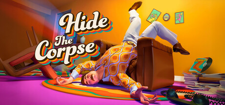
  • Genre Clarity: 7/10 — Physics comedy puzzle action clear. The ragdoll character mid-fall surrounded by scattered objects immediately signals physics-based gameplay and comedic tone. At TINY size, the chaotic prop arrangement and exaggerated character pose still read as a quirky action puzzle game rather than traditional action or strategy. The vibrant, playful aesthetic distinguishes it from serious combat titles, though the specific 'hide the corpse' mechanic is not visually obvious.
  • Title Readability: 8/10 — Bold white text reads well. The title 'Hide The Corpse' uses a chunky white script font with strong outline contrast against the warm orange-to-magenta gradient background. At SMALL size the text remains clearly legible with good letter spacing and weight. At TINY size the outline helps maintain readability, though fine serif details blur slightly—the core message still parses within 1 second of glancing.
  • Contrast & Color: 8/10 — Saturated warm palette pops well. The bright orange, yellow, and magenta gradient creates strong value separation from the dark Steam background (#1b2838), with the white title providing additional pop. The character's bright purple and orange outfit and the scattered colorful props (green items, red elements, yellow accents) maintain silhouette clarity even in grayscale due to tonal variation. The warm hues feel intentional and premium rather than muddy.
  • Uniqueness & Polish: 7/10 — Distinctive comedic style, minor asset feeling. The exaggerated physics ragdoll pose and surreal prop scatter communicate a unique comedic premise that stands apart from typical action game covers. The color treatment and character styling feel polished and intentional rather than templated. However, the scattered objects lack sophisticated arrangement—some props feel randomly placed rather than compositioned with purpose, and the overall craft sits slightly below the premium tier of reference titles like Hades II or Sea of Stars.
  • Brand Consistency: 6/10 — Colorful quirky tone, limited icon. The vibrant orange-magenta palette and comedic ragdoll aesthetic establish a recognizable indie comedy vibe consistent with the game's premise. Without reference to other capsules or in-game footage, there are no iconic symbols, characters, or motifs that would be instantly memorable on repeat viewing. The brand identity is more about 'chaotic fun' tone than a distinctive visual symbol or recurring design element.
  • Composition: 7/10 — Clear focal point, slightly scattered props. The ragdoll character in center-right creates a strong primary focal point that commands attention at all sizes. The title occupies upper-left with good spacing from the character, and the layered depth from background gradient through midground props to foreground character works well. At TINY size the main character and title remain the clear hierarchy, though scattered props in the lower area create minor visual noise that competes slightly with the primary message.

What works

  • Strong title-background contrast. White script text with outline on warm gradient ensures the title pops and reads instantly at TINY size without any legibility collapse.
  • Clear comedic genre signal. The ragdoll fall pose and chaotic prop scatter immediately communicate physics-based puzzle-action gameplay distinct from serious combat titles.
  • Vibrant saturated color palette. Orange-magenta-yellow hues create excellent value separation from Steam's dark background and remain visually distinct even in grayscale.
  • Intentional hierarchical layout. Title, character, and props are well-spaced with the ragdoll as the clear focal point that holds attention at small-to-tiny sizes.

What hurts the capsule

  • Scattered prop arrangement lacks purpose. The lower-area objects feel randomly placed rather than intentionally composed, creating visual noise that slightly competes with the main subject.
  • Generic indie asset feel in props. The scattered items (controllers, maps, etc.) lack distinctive character-specific styling and feel like stock puzzle game elements rather than branded identity.
  • No memorable iconic symbol. While the tone is distinctive, there are no recurring visual motifs or character icons that would build recognition across multiple views or marketing touchpoints.

Priority fixes

  1. [composition] Refine prop placement in lower area to create intentional depth layers and guide eye back to character rather than creating scattered clutter [uniqueness_polish]
  2. [brand_consistency] Introduce a distinctive recurring visual element or symbol (character silhouette, logo, or signature motif) that becomes recognizable across store pages and marketing [uniqueness_polish]
  3. [composition] Ensure all edge elements sit safely within Steam's crop margins at SMALL size to prevent critical props or title edges from being cut

Store copy priority fixes

  1. [uniqueness] Add a sentence explaining what makes the hiding mechanic or level design unique—e.g., 'Combine physics manipulation with interactive environment hazards' or 'Each location's unique mechanic (zero-gravity, time freezes) changes how you hide.'
  2. [feature_communication] Expand location descriptions to explain the *mechanical* twist of each, not just the theme—e.g., 'Museum: Use art pieces as mobile shields while hiding the body' rather than just 'conceal among exhibits.'
  3. [audience_targeting] Add a line clarifying difficulty tone and audience, such as 'Perfect for casual players seeking creative problem-solving' or 'Hardcore players: unlock Challenge Mode for speedrun leaderboards' to help players self-select.

Related guides

Steam app ID: 3405120 · Tags: Action, VR, Comedy, Strategy, Funny