Scoring genre clarity...
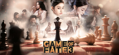
An accident transports you from 1945 to 2010, embroiling you in a high-society kidnapping case. Confused and disoriented, you discover that the victim is your own descendant. Gunfire erupts, chaos escalates, and schemes unfold within schemes... Don’t want to be a pawn? How to become the player?
$16.79Very Positive(726)
FMVCinematicFirst-Person
KARMAGAME HK LIMITEDDec 24, 2025