Solitaire Zero 21 scores 80/100 — better than 89% of Casual capsules (n=10,153).

Quick text summary

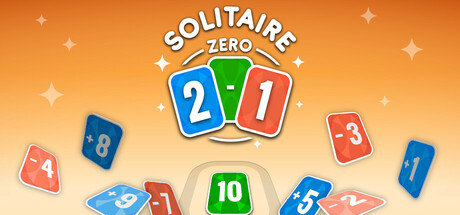
Solitaire Zero 21 scored 80/100 on Steam Analyzer — Good for a Casual capsule. Top priority fix: [uniqueness_polish] Introduce a distinctive visual character, mascot, or branded motif (e.g., a stylized icon or thematic element unique to Solitaire Zero 21) to increase memorability and stand out among competing casual card games.

Capsule scores by dimension

  • Genre Clarity: 8/10 — Card game mechanics clearly signaled. The prominent playing cards (2, 21, 1, 8, 4, 3, 5, 10) scattered across the composition immediately communicate a card-based gameplay mechanic. The central badge with numbers 2-1 reinforces the core 0-21 scoring system, and the casual, colorful card design reads as family-friendly card game at all sizes, including tiny thumbnails.
  • Title Readability: 9/10 — Title is bold and highly legible. SOLITAIRE ZERO 21 uses a clean, white sans-serif font with strong contrast against the warm orange gradient background. The text remains fully readable at small and tiny sizes due to thick letterforms and ample letter spacing; the central badge placement supports the title hierarchy without competing visually.
  • Contrast & Color: 9/10 — Excellent value separation and vibrancy. The warm orange-to-cream gradient background provides strong separation from the bright primary-colored cards (blue, green, red) and white title text. In grayscale, the card silhouettes maintain clear edges and the title pops distinctly, ensuring the design reads at quick glance and tiny sizes without muddy midtones or subject-background blending.
  • Uniqueness & Polish: 7/10 — Polished casual design with clear hook. The art direction is clean and intentional, with consistent vector-style cards and a cohesive playful aesthetic that communicates the solitaire mechanics. While the design is well-executed and premium-feeling for casual category, the visual concept is somewhat standard for card games; the 0-21 scoring system hint in the badge is the main differentiator that prevents this from feeling completely generic.
  • Brand Consistency: 7/10 — Consistent vector style, recognizable identity. The card design system is internally cohesive with matching rounded corner treatments, consistent color blocking, and uniform numbering style across all visible cards. The warm orange palette and playful card-scatter composition create a recognizable brand feel; however, without reference to additional store assets, it is difficult to confirm whether iconic character or motif elements extend across all touchpoints.
  • Composition: 8/10 — Well-balanced focal hierarchy. The central SOLITAIRE ZERO 21 badge acts as a strong primary focal point, with scattered cards creating secondary interest and leading the eye outward naturally. The cards are layered with clear depth from background gradient through midground cards to the foreground badge, and the composition remains readable at small and tiny sizes with no critical elements at risky edge positions.

What works

  • Title visibility and contrast. White sans-serif text with strong outline and central placement ensures the title is legible at all viewing scales, from full header to tiny thumbnail.
  • Color and vibrancy impact. Bright primary-colored cards and warm orange gradient create immediate visual appeal against the Steam dark background and draw quick recognition in scroll conditions.
  • Clear gameplay communication. The scattered card composition and central score badge communicate card game mechanics and the 0-21 core loop at a glance, making genre and mechanic obvious even at tiny size.
  • Cohesive vector aesthetic. Consistent card design, rounded corners, and uniform styling across all elements reinforce a polished, professional, and recognizable brand feel.

What hurts the capsule

  • Generic card game aesthetic. While well-executed, the overall visual concept relies on familiar card-game tropes and does not establish a particularly distinctive or memorable identity compared to other casual card titles.
  • Limited visual storytelling. The capsule focuses on card mechanics but does not hint at unique gameplay features, progression systems, or narrative hooks that might set it apart in discovery.

Priority fixes

  1. [uniqueness_polish] Introduce a distinctive visual character, mascot, or branded motif (e.g., a stylized icon or thematic element unique to Solitaire Zero 21) to increase memorability and stand out among competing casual card games.
  2. [composition] Verify that no cards or text elements will be cropped during Steam's responsive image handling across different display widths and confirm all key elements remain within safe margins.

Store copy priority fixes

  1. [hook_strength] Replace 'Card game fit for all the family' with a verb-driven hook that emphasizes the tension or skill, e.g., 'Stay in the zone: Keep your score between 0 and 21 as you race through a deck of tricky math cards—one wrong pick and it's game over.'
  2. [uniqueness] Add a sentence that articulates what makes this solitaire variant distinct, such as 'Unlike traditional solitaire, every card you pick changes your score, turning each decision into a high-stakes math puzzle.'
  3. [tone_match] Rewrite the Gameplay section to use more dynamic, engaging language ('You must strategically choose', 'the challenge intensifies') instead of passive procedural description ('The player selects', 'The objective is').

Related guides

Steam app ID: 3407270 · Tags: Casual, Card Game, Puzzle, Solitaire, 2D