Scoring genre clarity...
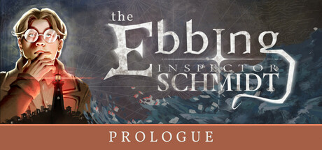
This is the prologue to Inspector Schmidt - The Ebbing. In this detective RPG, the captain of a steamship collapses under mysterious circumstances during lunch. What happened? Question the passengers, discover and combine clues, and succeed in dice-based skill checks to solve the case.
Free to PlayPositive(28)
AdventureRPGAction-Adventure
Active Fungus StudiosMar 11, 2025