Scoring genre clarity...

Harmony Of Fear capsule

Harmony Of Fear

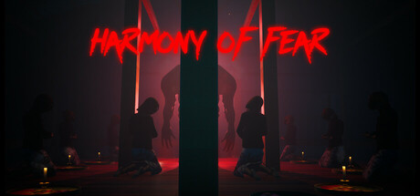
In Harmony of Fear, you will take on the role of Dian, a music instructor who brings her students to a secluded villa for a music rehearsal. Uncover dark secrets and face supernatural threats in this gripping psychological horror inspired by Indonesian folklore.

$2.99Positive(16)
AdventureSimulationPsychological Horror
ThreeFraudsMar 28, 2025

Harmony Of Fear scores 68/100 — better than 22% of Adventure capsules (n=7,922).

Positive (16 reviews) · $2.99 · Released Mar 28, 2025 · By ThreeFrauds

Quick text summary

Harmony Of Fear scored 68/100 on Steam Analyzer — Solid for a Adventure capsule. Top priority fix: [title_readability] Reduce decorative glitch distortion on letterforms by 20-30% to preserve legibility at TINY size while maintaining neon aesthetic

Capsule scores by dimension

  • Genre Clarity: 7/10 — Horror atmosphere clear, genre intent readable. The red neon title, dark villa setting with silhouetted figures, and ominous lighting immediately signal psychological horror with supernatural themes. At TINY size, the red glow and architectural silhouettes still register as horror/mystery, though the specific Indonesian folklore angle is lost. The composition successfully avoids action-game or adventure-game visual language in favor of dread and atmosphere.
  • Title Readability: 6/10 — Title legible but decorative distortion present. HARMONY OF FEAR displays in bright red neon text with intentional jagged, distorted letterforms that read clearly at full size but lose some legibility at TINY due to the irregular edges collapsing into blur. At SMALL size the title remains identifiable but the decorative glitch effect slightly reduces precision. The placement centered and elevated against the dark background prevents text-on-texture issues that plague similar horror games.
  • Contrast & Color: 8/10 — Strong red-on-dark separation, atmospheric lighting. The bright red neon HARMONY OF FEAR stands in excellent value contrast against the near-black background (#1b2838 match), with warm amber architectural lighting adding depth layering. The red glow halos around the text create silhouette clarity even at TINY size where the neon pop remains unmissable. Grayscale test confirms strong light-dark separation with the red channel translating to high brightness values that separate cleanly from midtone villa elements.
  • Uniqueness & Polish: 7/10 — Distinctive horror aesthetic, cohesive craft. The neon glitch-text treatment combined with moody villa architecture and subtle figure silhouettes creates a premium, intentional visual identity that avoids generic horror clichés like jump-scares or creature focus. The restraint in showing only shadowed musicians and architectural mood rather than explicit threats suggests sophistication. However, the execution remains within expected psychological horror visual language without a truly standout unique hook that screams 'this is Harmony of Fear' rather than 'this is a horror game.'
  • Brand Consistency: 6/10 — Coherent mood, limited brand identity markers. The capsule maintains consistent rendering style with the red neon + dark villa + warm architectural lighting creating internal cohesion across visual elements. The silhouetted figures and Indonesian villa setting establish thematic consistency with the game's premise around a secluded music rehearsal with folklore undertones. However, there is no iconic character, distinctive color palette beyond red-on-black, or memorable motif that would make this capsule instantly recognizable as Harmony of Fear versus a generic horror title without reference to store screenshots.
  • Composition: 7/10 — Clear focal point, balanced depth layering. The central vertical pillar creates strong compositional anchor with the red neon title hovering above at the top third, drawing eye upward while silhouetted figures and architectural elements frame left and right. The depth layering—dark foreground, illuminated midground villa structure, shadowed background—creates visual hierarchy that reads clearly at SMALL and TINY sizes. Title sits safely in upper margin without edge-crop risk, and the symmetrical composition prevents awkward empty gaps, though the centered pillar approach is somewhat conventional for horror imagery.

What works

  • Red neon pop against dark background. The bright red HARMONY OF FEAR title achieves excellent contrast separation that makes the capsule immediately visible in Steam scroll views and maintains clarity down to TINY thumbnail size.
  • Atmospheric mood over exposition. The composition prioritizes psychological horror ambiance through lighting and silhouettes rather than explicit threats, suggesting premium storytelling intent and thematic sophistication.
  • Depth layering and spatial clarity. The foreground-midground-background stratification with warm villa lighting against dark surroundings creates readable visual hierarchy that doesn't flatten at reduced sizes.

What hurts the capsule

  • Glitched text loses precision at small sizes. The intentionally distorted letterforms in HARMONY OF FEAR become harder to parse at SMALL and especially TINY sizes where the decorative jagged edges blur into illegibility.
  • Limited brand identity signals. The capsule lacks iconic character, signature motif, or distinctive palette that would make this visually recognizable as Harmony of Fear versus any psychological horror game.
  • Generic horror composition conventions. While executed well, the centered pillar with silhouetted figures against moody lighting is a familiar horror game visual formula without a unique spatial or compositional hook.

Priority fixes

  1. [title_readability] Reduce decorative glitch distortion on letterforms by 20-30% to preserve legibility at TINY size while maintaining neon aesthetic
  2. [brand_consistency] Introduce a visual signature element—such as a recurring architectural motif, color accent, or symbolic shape—that becomes recognizable across future marketing materials and store screenshots
  3. [uniqueness_polish] Consider adding a subtle UI element or visual detail that hints at the music/rehearsal theme (score fragment, instrument silhouette, musical notation) to differentiate from generic horror imagery

Store copy priority fixes

  1. [feature_communication] Add a bullet-point list of core gameplay mechanics after the opening paragraph: 'Uncover hidden clues through exploration, solve environmental puzzles, discover interconnected story threads, and navigate choices that affect your students' safety.'
  2. [uniqueness] Expand the Indonesian folklore reference with one concrete example in the detailed description: 'Drawing inspiration from [specific folklore tradition], the villa becomes a nexus where [specific supernatural element] manifests, creating a horror rooted in unfamiliar cultural fears.'
  3. [feature_communication] Explicitly mention the hidden object mechanic as a verb: 'Search cluttered environments for clues that reveal the villa's secrets and Dian's connection to its dark past.'

Related guides

Steam app ID: 3408570 · Tags: Adventure, Simulation, Psychological Horror, Singleplayer, First-Person