Scoring genre clarity...

Die For The Lich capsule

Die For The Lich

Gather magical dice, adapt your gear and venture through a land haunted by folklore creatures.

$11.99Very Positive(260)
Early AccessDiceDeckbuilding
MonovoidNov 10, 2025

Die For The Lich scores 82/100 — better than 94% of Early Access capsules (n=3,067).

Very Positive (260 reviews) · $11.99 · Released Nov 10, 2025 · By Monovoid

Quick text summary

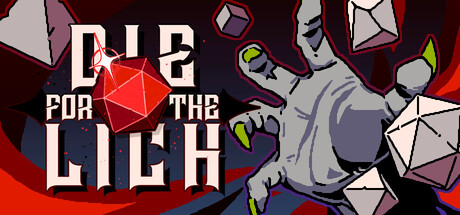
Die For The Lich scored 82/100 on Steam Analyzer — Good for a Early Access capsule. Top priority fix: [uniqueness_polish] Ensure the lich character or other narrative elements are consistently emphasized across store screenshots to establish stronger brand identity beyond the d20 mechanic alone.

Capsule scores by dimension

  • Genre Clarity: 8/10 — Strong tabletop RPG visual language. The large red d20 die, scattered polyhedron dice, and arcane aesthetic immediately signal tabletop RPG mechanics and dungeon-crawling gameplay. The lich-like creature silhouette on the right reinforces fantasy RPG genre expectations. At tiny size, the iconic d20 and dice scatter remain instantly recognizable as core mechanical imagery.
  • Title Readability: 8/10 — Bold white text, clear hierarchy. The title 'DIE FOR THE LICH' uses bold white sans-serif lettering with strong contrast against the dark burgundy background and strategic placement around the d20 centerpiece. The text maintains readability at small and tiny sizes due to thick letterforms and high value contrast. At tiny size, the title compresses slightly but remains legible due to clear spacing and weight.
  • Contrast & Color: 9/10 — Excellent value separation and saturation. Bright white title text, vivid red d20, cool gray-blue lich creature, and warm orange-red gradient background create strong value and hue separation that pops against the Steam dark background. The silhouettes read cleanly in grayscale due to deliberate light-dark contrast between elements. Even at tiny size, the color composition maintains distinct visual layers without muddy mid-tones.
  • Uniqueness & Polish: 8/10 — Polished dice-centric visual hook. The centered glowing red d20 die as the primary visual anchor is a distinctive mechanical choice that communicates the game's dice-driven gameplay rather than generic fantasy scenery. The low-poly lich creature in cool tones contrasts nicely with the warm center, creating intentional color storytelling. The overall craft feels premium and specific to this game's identity, avoiding template fatigue.
  • Brand Consistency: 7/10 — Coherent arcane dice aesthetic. The visual identity centers on magical dice and arcane creatures, establishing a recognizable motif for Die For The Lich. The color palette of burgundy, white, red, and cool grays appears intentional and cohesive. Without seeing 15 store screenshots, internal consistency within this capsule shows strong direction, though memorability will depend on how distinctly this translates across marketing materials.
  • Composition: 9/10 — Excellent focal hierarchy and balance. The red d20 die anchors the center as the clear primary focal point, with the lich creature positioned right to provide secondary interest without competing. The title frames the d20 naturally, and the scattered white polyhedron dice guide the eye through the composition without creating clutter. The layout maintains safe margins and crop resilience—no critical elements touch dangerous edges, and the design reads effectively from full header down to tiny thumbnail size.

What works

  • Iconic mechanical centerpiece. The large glowing red d20 die immediately communicates dice-driven gameplay and serves as a memorable brand symbol that distinguishes this from generic fantasy RPGs.
  • Strong contrast and color separation. High-value white text, saturated red die, and cool-toned lich creature create excellent visual separation that maintains clarity even at tiny thumbnail size against the Steam background.
  • Clean title typography and placement. Bold sans-serif lettering with strategic positioning around the d20 ensures readability across all sizes without sacrificing design elegance.
  • Balanced focal hierarchy. The composition guides attention from the d20 center to supporting elements in a natural flow, avoiding clutter or equal-emphasis chaos.

What hurts the capsule

  • Limited character presence. The lich creature is interesting but only partially visible and less visually dominant than the d20, which may reduce emotional connection compared to a stronger protagonist focus.
  • Dice scatter pattern lacks depth cueing. The scattered white polyhedron dice around the edges feel somewhat decorative rather than part of a clear spatial depth layer, reducing compositional richness.

Priority fixes

  1. [uniqueness_polish] Ensure the lich character or other narrative elements are consistently emphasized across store screenshots to establish stronger brand identity beyond the d20 mechanic alone.
  2. [composition] Consider adding subtle shadow or depth beneath scattered dice to reinforce foreground-midground-background layering and increase visual sophistication.
  3. [brand_consistency] Verify that color palette (burgundy, red, cool gray, white) remains consistent across all marketing materials and in-game UI to maximize visual recognition.

Store copy priority fixes

  1. [hook_strength] Restructure the page to move the 'About the Game' section above the development announcement, or create a clear 'Current Status' banner so prospective players learn about the game before the hiatus news.
  2. [feature_communication] Replace the rhetorical question format with a bulleted feature list: 'Pair dice with gear for synergies,' 'Fuse dice to customize outcomes,' 'Face randomized encounters and a final boss fight,' etc.
  3. [audience_targeting] Add a sentence like 'If you loved Slay the Spire's run-based strategy and deck customization, Die For The Lich reimagines that formula with dice-driven chaos and push-your-luck mechanics.'
  4. [uniqueness] Explain why the dice-for-cards swap matters: e.g., 'Dice create dynamic variance and reward decision-making under uncertainty—you manage probabilities rather than fixed card effects.'

Related guides

Steam app ID: 3415570 · Tags: Early Access, Dice, Deckbuilding, Roguelike, Turn-Based Strategy