Scoring genre clarity...
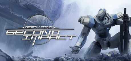
Death Ring: Second Impact is a turn-based Roguelite strategy game. As the commander of the "Griffin" squadron, you must lead your Mechas and Pilots to resist the threat of mutated monsters and approaching to the secrets hidden behind the Death Ring.
$19.99Mostly Positive(158)
Turn-Based TacticsWargameRoguelite
Rouge MechaJul 11, 2025