Scoring genre clarity...
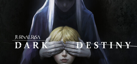
Witness the resurrection of the foretold nemesis of the Jurnal Risa family, which was never revealed before. Unveil its dark destiny within this horror-adventure game. This is all about family. Tale of Jurnal Risa, as recounted to me by Risa herself.
$6.498 user reviews
AnimeHorrorSupernatural
Digital HappinessSep 25, 2025