Scoring genre clarity...

GOD FORSAKEN capsule

GOD FORSAKEN

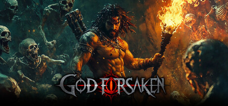
The God - Forsaken Land is a roguelike survival adventure game that combines the features of Diablo. In this abandoned land of despair, you fend off endless monsters, light a fire in the darkness, and search for that faint glimmer of hope.

$13.99Mixed(18)
Action RoguelikeBullet HellLoot
insight studioFeb 3, 2026

GOD FORSAKEN scores 63/100 — better than 3% of Action Roguelike capsules (n=1,675).

Mixed (18 reviews) · $13.99 · Released Feb 3, 2026 · By insight studio

Quick text summary

GOD FORSAKEN scored 63/100 on Steam Analyzer — Solid for a Action Roguelike capsule. Top priority fix: [title_readability] Simplify serif typography to a bolder sans-serif or add a contrasting stroke outline to ensure legibility at TINY size without prior brand familiarity.

Capsule scores by dimension

  • Genre Clarity: 7/10 — Dark action fantasy clear. The central flaming skeletal warrior surrounded by undead enemies immediately signals action-adventure with dark fantasy and roguelike survival themes. The fire effects, skull iconography, and aggressive combat poses read well at SMALL size, though at TINY size the specific roguelike mechanic is less apparent—it reads more as generic dark action rather than explicitly suggesting Diablo-style loot systems or turn-based strategy elements.
  • Title Readability: 6/10 — Title readable full, weak tiny. At FULL size, 'GOD FORSAKEN' is legible with clean serif styling and adequate contrast against the darker background regions. At TINY size (120x45), the text begins to blur and loses definition; the serif details collapse, making it harder to distinguish individual letters on quick scroll without prior familiarity with the title.
  • Contrast & Color: 7/10 — Strong warm tones pop. The orange and golden fire effects create excellent value separation against the cooler teal and dark tones of the background, with the central character silhouette reading clearly in silhouette tests. The warm-cool contrast is intentional and effective, though some mid-tone blending occurs in the skull/undead crowd on the left that could reduce clarity at TINY size during quick scroll.
  • Uniqueness & Polish: 6/10 — Competent but visually familiar. The composition—central flaming warrior surrounded by undead—follows a well-established dark fantasy template seen in similar genre titles (Diablo-style games, roguelikes). While the execution is clean with decent particle effects and lighting, the concept lacks a distinctive visual hook or memorable art direction that would make it stand out against peer titles like Black Myth: Wukong or Lies of P, which use more unique character designs or artistic styles.
  • Brand Consistency: 5/10 — Generic dark fantasy palette. The image uses standard genre palette—oranges, teals, blacks, and skull imagery—without establishing a memorable internal identity or signature aesthetic that would carry across the 12 store screenshots. No clear iconic character trait, color motif, or visual symbol emerges that would make this capsule recognizable as specifically GOD FORSAKEN rather than any other dark roguelike title.
  • Composition: 7/10 — Clear focal point, minor balance. The central flaming skeleton serves as a strong primary focal point with supporting undead elements creating depth and framing. The title sits across the lower third with reasonable safe margins, and the composition holds at SMALL size. However, the left-side crowd of undead enemies creates slight visual scatter that dilutes focus at TINY size, and the composition relies heavily on the center without fully leveraging the breadth of the canvas.

What works

  • Strong warm-cool color contrast. Orange fire and golden effects pop distinctly against teal and dark backgrounds, maintaining clear silhouette separation even in grayscale stress tests.
  • Clear primary focal point. The central flaming warrior immediately anchors attention and clearly reads as the main subject across all viewing sizes.
  • Readable title at full size. At full header size, 'GOD FORSAKEN' uses clean serif typography with sufficient contrast and spacing for comfortable legibility.

What hurts the capsule

  • Title collapse at tiny size. Serif details and letter spacing become illegible at 120x45 pixel sizes during quick scroll, requiring prior recognition rather than readability.
  • Generic visual presentation. The flaming skeleton surrounded by undead follows a tired dark fantasy template with no distinctive visual style or memorable art direction that differentiates it from competitor titles.
  • Weak brand identity signals. No iconic character trait, signature palette, or memorable motif emerges that would create recognizable brand consistency across marketing materials.
  • Visual scatter in supporting elements. The left-side undead crowd competes with the primary focal point and creates noise that dilutes clarity at smaller sizes.

Priority fixes

  1. [title_readability] Simplify serif typography to a bolder sans-serif or add a contrasting stroke outline to ensure legibility at TINY size without prior brand familiarity.
  2. [uniqueness_polish] Develop a distinctive character design or signature visual motif (unique silhouette, color treatment, or art style) that differentiates this capsule from generic dark fantasy templates.
  3. [brand_consistency] Establish and emphasize a signature color palette or iconic element (e.g., specific skull type, rune symbols, or lighting style) that signals GOD FORSAKEN uniquely across all store assets.
  4. [composition] Reduce visual clutter on the left side by simplifying the undead crowd silhouettes or repositioning elements to strengthen the central focal point at SMALL and TINY sizes.

Store copy priority fixes

  1. [hook_strength] Rewrite the short description opening to lead with the sanity-darkness mechanic as the core hook: 'Survive a cursed land where encroaching darkness eats your sanity—light torches, master class-specific skill trees, and battle endless monsters in this roguelike blend of Diablo action and psychological survival.'
  2. [feature_communication] Restructure the detailed description with a scannable feature list after the atmospheric opening, clearly bulleting: classes and skill trees, modular build system, Diablo-style loot, sanity-darkness mechanic, exploration secrets, and boss encounters.
  3. [uniqueness] Add a paragraph explicitly differentiating the sanity mechanic: 'Unlike traditional roguelikes, darkness here is not just a visual—it actively corrodes your mind, forcing strategic torch placement and time management alongside combat decisions, creating a survival tension unique to this game.'
  4. [audience_targeting] Add a clear audience signal sentence early in the detailed description: 'Designed for players who crave deep build customization and tactical decision-making under pressure, this is a solo roguelike experience with high replayability and permadeath stakes.'

Related guides

Steam app ID: 3419290 · Tags: Action Roguelike, Bullet Hell, Loot, Roguelike, Beat 'em up