Scoring genre clarity...
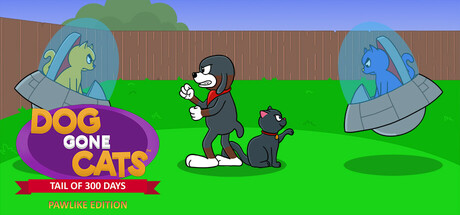
"Casual backyard puzzle adventure! Help Cosmo the dog protect Stella from catnappers across 300 deadly levels. Avoid traps in hidden grids, use magic yarn balls, and survive with just 30 lives!"
$3.99
Turn-Based TacticsMatch 3Hidden Object
Team PueoMay 31, 2025