Scoring genre clarity...

BETWEEN capsule

BETWEEN

"May you leave no regrets in this journey of life." 、 An independent game about death. Explore the past lives in an atmospheric graveyard.

Free to PlayPositive(24)
TypingExplorationPerma Death
Bingxiao LuoApr 29, 2025

BETWEEN scores 72/100 — better than 46% of Typing capsules (n=214).

Positive (24 reviews) · Free to Play · Released Apr 29, 2025 · By Bingxiao Luo

Quick text summary

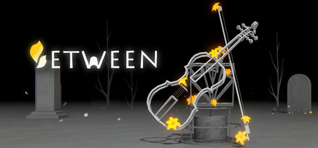
BETWEEN scored 72/100 on Steam Analyzer — Good for a Typing capsule. Top priority fix: [composition] Shift violin and flame elements slightly left to ensure full visibility within safe margin boundaries and prevent Steam edge cropping at all sizes.

Capsule scores by dimension

  • Genre Clarity: 7/10 — Atmospheric indie with death theme clear. The graveyard setting with tombstones, ethereal violin instrument, and contemplative mood clearly signal a narrative-focused indie game about life and death. At TINY size, the silhouette of the violin and gravestones remain recognizable, though the specific "death exploration" mechanic is less obvious without context. The atmospheric staging effectively communicates introspection over action gameplay.
  • Title Readability: 8/10 — Bold sans-serif title reads consistently. BETWEEN is rendered in clean, white, uppercase sans-serif positioned in the upper left with strong contrast against dark background. The letterforms maintain legibility at SMALL and TINY sizes without decorative flourish. The title placement on a relatively clear region avoids competing with background clutter, though at TINY size some fine detail of the violin may overlap slightly.
  • Contrast & Color: 8/10 — Strong light-to-dark separation effective. White title text and golden/yellow violin elements pop cleanly against the near-black background, creating excellent value separation. The grayscale test confirms sharp silhouettes for the violin, tombstones, and flame particles. At SMALL and TINY sizes, the bright violin and golden accents maintain clear visual hierarchy without muddy midtones or subject blending.
  • Uniqueness & Polish: 7/10 — Atmospheric prop design, somewhat familiar. The central violin surrounded by cremation flames and gravestones is a thoughtful visual metaphor for the game's death-and-memory theme, showing intentional art direction. The rendering and particle effects feel polished and cohesive. However, the graveyard-meditation aesthetic is not entirely unique within indie games, and the composition reads as thematic rather than instantly distinctive; at TINY size it reads as a moody indie game without a standout hook that separates it from similar reflective titles.
  • Brand Consistency: 6/10 — Coherent but not yet iconic. The color palette (black, white, gold), monochromatic environment, and violin motif form a consistent internal identity that aligns with the game's reflective theme. The style is cohesive across the capsule, but without reference to the eight store screenshots, it is difficult to confirm whether this visual language is reinforced elsewhere or if a memorable brand symbol (character, icon, pattern) is present. The violin could serve as a signature motif if used consistently across all marketing.
  • Composition: 7/10 — Clear focal point, good layering depth. The violin and flame particles occupy the center-right focal point, drawing immediate attention, while gravestones and minimal landscape elements provide background depth and context. The composition layers foreground (flames), midground (violin), and background (landscape) effectively. At SMALL and TINY sizes, the central violin remains the primary subject and does not get lost; however, the right-side violin elements approach the edge and risk minor cropping on some Steam displays.

What works

  • Strong contrast against dark Steam background. White title and golden violin elements create excellent value separation that remains visible at TINY size without muddy blending.
  • Thematically coherent visual metaphor. The violin, flames, and gravestones together communicate a reflective game about life, death, and memory with intentional art direction.
  • Readable sans-serif title placement. BETWEEN is positioned on a clear region in the upper left and maintains legibility across all viewing sizes without decorative distortion.

What hurts the capsule

  • Right-side elements risk Steam crop cutoff. The violin and flame particles extend toward the right edge and may be partially clipped on certain Steam display resolutions or thumbnail crops.
  • Limited uniqueness within reflective indie space. The graveyard-meditation aesthetic and visual approach, while well-executed, do not immediately stand out from other contemplative indie games in the same genre tier.
  • Brand identity symbols not yet iconic. While the violin and graveyard motifs are thematically appropriate, they lack the instant recognizability of top-tier indie brands like Balatro or DAVE THE DIVER.

Priority fixes

  1. [composition] Shift violin and flame elements slightly left to ensure full visibility within safe margin boundaries and prevent Steam edge cropping at all sizes.
  2. [uniqueness_polish] Introduce a distinctive recurring visual element or character motif that appears across all marketing materials to build brand recognition and icon status.
  3. [genre_clarity] Consider adding a subtle UI hint or secondary object (e.g., photograph, memory fragment visual) to more clearly signal the "exploration of past lives" mechanic at TINY size.

Store copy priority fixes

  1. [feature_communication] Expand the detailed description with 3–4 sentences explaining: what stories you uncover, how many gravestones/lives exist, what "settling souls" achieves mechanically/narratively, and rough playtime. Example: 'Each gravestone holds a unique life story. Type their name to reveal memories, regrets, and unfinished business. Settle their souls by making choices that honor their final wishes.'
  2. [hook_strength] Rewrite the opening of the detailed description to lead with the core emotional or mechanical hook rather than credits. Example: 'In a quiet graveyard, every gravestone tells a story. Type the names of the dead and unravel the lives they left behind—a game about memory, loss, and finding peace.'
  3. [audience_targeting] Add a single sentence that signals who this game is for. Example: 'For players seeking intimate, reflective experiences about human connection and mortality.' or 'If you loved Spiritfarer or Kentucky Route Zero, BETWEEN offers a contemplative journey through memory.'
  4. [uniqueness] Add one sentence explaining why typing is the interaction method. Example: 'Typing transforms names from simple data into an act of remembrance—a personal connection to each story you uncover.'

Related guides

Steam app ID: 3422090 · Tags: Typing, Exploration, Perma Death, Cinematic, Casual