Scoring genre clarity...

Ball Drop capsule

Ball Drop

Get the ball to the end zone safely. Without exploding!

Free to PlayPositive(17)
StrategyCasualPuzzle
Urban IsotopeMar 5, 2025

Ball Drop scores 68/100 — better than 18% of Strategy capsules (n=5,103).

Positive (17 reviews) · Free to Play · Released Mar 5, 2025 · By Urban Isotope

Quick text summary

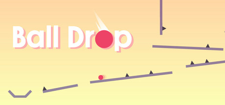
Ball Drop scored 68/100 on Steam Analyzer — Solid for a Strategy capsule. Top priority fix: [genre_clarity] Add a subtle visual hint of the 'exploding' mechanic—such as a small spark or danger indicator near the ball—to communicate the unique risk element and strategy layer.

Capsule scores by dimension

  • Genre Clarity: 7/10 — Casual puzzle mechanics apparent. The bouncing ball and angled platforms clearly communicate a physics-based casual puzzle game. At tiny size, the red ball and geometric track elements remain visible and suggest trajectory-based gameplay. However, the 'strategy' and 'without exploding' elements are not visually communicated, leaving some genre nuance unclear.
  • Title Readability: 8/10 — Bold white title stands clear. The white 'Ball Drop' text with clear letterforms and generous spacing reads well at full size and maintains legibility at small size. At tiny size the text remains recognizable due to high contrast against the pale background, though fine serifs blur slightly. Placement at top-left avoids platform obstruction and provides stable anchor.
  • Contrast & Color: 7/10 — Warm palette readable but soft. The light peach-yellow background with white title and pink-red ball creates adequate value separation against Steam's dark background. The red ball pops well and the white text has strong contrast. At tiny size the warm palette reads clearly, though the overall softness and limited mid-tone depth reduce visual punch compared to high-contrast competitors.
  • Uniqueness & Polish: 6/10 — Competent minimal design approach. The clean geometric aesthetic with simple shapes (ball, platforms, lines) feels intentional and craft-aware rather than generic. However, the visual presentation lacks a distinctive hook or memorable unique selling point—it reads as a well-executed baseline casual game without a signature style or storytelling element that differentiates it from the many physics-puzzle entries in the market.
  • Brand Consistency: 6/10 — Minimal identity cues present. The capsule presents a clean, simple visual language consistent with casual game aesthetics, but there are no strong iconic characters, motifs, or signature palette elements that would create memorable brand recognition. The red ball and geometric platforms are functional but generic—they could apply to many puzzle games without clear internal identity signals that suggest this specific title.
  • Composition: 7/10 — Clear hierarchy with good balance. The title anchors the top-left, the red ball draws focus as primary subject in the center, and angled platforms create visual flow and depth layering. At small size the focal point remains clear and elements do not scatter attention. Margins are reasonably safe, though the right edge platforms sit close to the crop boundary—acceptable but could be tighter.

What works

  • High-contrast white title. White letterforms read clearly at all sizes against the soft background and maintain strong legibility at tiny thumbnail scale.
  • Clear focal point and depth. The red ball serves as a strong visual anchor, and the angled platforms create layered composition that guides the eye naturally through the frame.
  • Intentional minimalist craft. Geometric shapes and clean spacing feel intentionally designed rather than assembled from generic assets.

What hurts the capsule

  • Generic visual identity. The red ball and platform aesthetic offer no memorable or distinctive brand cues that would help recognition among similar casual puzzle games.
  • Limited value contrast palette. The warm peach-yellow background, while readable, lacks the strong dark-light separation and saturation control of higher-performing genre peers.
  • No gameplay mechanic hint. The capsule does not visually communicate the 'without exploding' mechanic or strategy elements mentioned in the description—viewers see only a basic ball-and-track puzzle.

Priority fixes

  1. [genre_clarity] Add a subtle visual hint of the 'exploding' mechanic—such as a small spark or danger indicator near the ball—to communicate the unique risk element and strategy layer.
  2. [uniqueness_polish] Introduce a signature color accent or character element that could serve as a recognizable brand motif across future marketing and store presence.
  3. [contrast_color] Deepen the background value or increase saturation in the platform geometry to create stronger silhouette separation and visual pop against the Steam dark background.

Store copy priority fixes

  1. [uniqueness] Replace 'Beautiful minimalist design' with a specific visual or mechanical differentiator—e.g., 'Physics-based momentum platforming' or 'Neon minimalist aesthetic inspired by [visual reference]' to clarify what sets Ball Drop apart.
  2. [feature_communication] Expand the overview with 2–3 sentences describing how gameplay evolves—e.g., 'Master the tap-to-jump timing, then face moving obstacles, gravity shifts, and time-based challenges as you progress toward the end zone.'
  3. [hook_strength] Add a second sentence to the short description that hints at progression or escalation—e.g., 'Get the ball to the end zone safely. Without exploding! Master 104 increasingly devious levels.'
  4. [feature_communication] Replace generic feature praise with concrete mechanics—e.g., instead of 'great music and sound effects,' specify 'Responsive sound design that reacts to every jump and collision' or list specific level types or hazards.

Related guides

  • Steam page optimisationCapsule, copy, screenshots, tags — the full Steam page conversion stack.
  • Steam tags guideTag selection, ordering, and how it shapes Steam's recommendation rails.

Steam app ID: 3422830 · Tags: Strategy, Casual, Puzzle, Platformer, 2D Platformer