Skills and Slimes scores 62/100 — better than 2% of Action Roguelike capsules (n=1,675).

Quick text summary

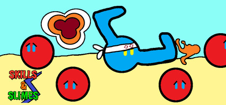
Skills and Slimes scored 62/100 on Steam Analyzer — Solid for a Action Roguelike capsule. Top priority fix: [title_readability] Move the title to the top or use a bolder, higher-contrast outline; ensure the text remains legible at 120x45px by increasing letter size and simplifying the gradient effect.

Capsule scores by dimension

  • Genre Clarity: 7/10 — Clear casual action-adventure vibe. The blue character in mid-jump pose with red spherical enemies and a playful art style clearly signals an action game with comedic or lighthearted tone. At tiny size, the character silhouette and red enemy circles remain readable, though the specific 'slimes' identity could be sharper; the overall impression reads as casual action rather than the darker action-RPG benchmarks in the genre list.
  • Title Readability: 6/10 — Readable but cramped at small sizes. The title 'SKILLS & SLIMES' is present in the lower left with a gradient effect (red and green text), but at small capsule size (~231x87) and tiny size (~120x45), the text becomes cramped and the color separation loses clarity against the cyan background. The title does not collapse completely, but the readability edge is thin and the placement on a busy area with the character reduces hierarchy.
  • Contrast & Color: 7/10 — Strong primary colors, good pop. Bright cyan background, bold red circles, and saturated blue character create strong value and saturation separation that pops well against Steam's dark theme (#1b2838). The red spheres and blue character silhouette read clearly even at tiny sizes, though the yellow mid-section and overlapping text colors introduce some mid-tone muddiness that slightly reduces pure contrast efficiency in grayscale.
  • Uniqueness & Polish: 5/10 — Cheerful but generic indie aesthetic. The capsule employs a clean, colorful cartoon style with simple geometric shapes (circles, basic character form) that feels intentional and craft-aware, but the overall composition lacks a distinctive hook or memorable visual identity. The art direction is competent and fits the 'slimes' theme, but compared to top-performing indie titles like Balatro or Dave the Diver, there is no standout visual storytelling or signature element that suggests a unique selling point.
  • Brand Consistency: 6/10 — Consistent internal style, limited recognition. The cartoon aesthetic, primary color palette (cyan, red, blue, yellow), and simple geometric rendering are internally cohesive and suggest a recognizable art direction if seen repeatedly. However, without access to the 18 reference screenshots, the capsule alone does not establish an iconic character, motif, or palette that would be memorable or distinctly branded compared to other casual indie games.
  • Composition: 6/10 — Balanced layout with busy middle. The blue character in the center provides a clear focal point, with red enemy spheres distributed as supporting elements around the frame, creating decent spatial balance. However, the title placement in the lower left overlaps with the character action, and the overall composition feels somewhat scattered; the cyan-yellow split background is functional but creates a horizontal cut that divides attention rather than guides it coherently at small sizes.

What works

  • Vibrant color contrast. Red and blue elements stand out sharply against the cyan background and will pop clearly on Steam's dark interface even at thumbnail sizes.
  • Clear central character pose. The blue character's dynamic jump pose reads immediately as action-oriented and provides an intuitive focal point that anchors the composition.
  • Coherent cartoon style. The simplified geometric art direction is internally consistent and reinforces a lighthearted, accessible game tone.

What hurts the capsule

  • Cramped title placement and readability. The 'SKILLS & SLIMES' text is squeezed into the lower left corner with a gradient that loses legibility at small and tiny sizes, competing with the character rather than commanding hierarchy.
  • Generic composition structure. The scattered red circles and simple layout lack sophisticated hierarchy or visual storytelling; the design feels more like a placeholder than a premium, purposeful capsule.
  • No distinctive brand identity signal. The capsule communicates genre but does not establish an iconic character, symbol, or visual motif that would be immediately recognizable across marketing materials.
  • Background composition feels unmotivated. The cyan-to-yellow split serves no clear compositional or narrative function and creates a visual seam that distracts rather than enhances the design.

Priority fixes

  1. [title_readability] Move the title to the top or use a bolder, higher-contrast outline; ensure the text remains legible at 120x45px by increasing letter size and simplifying the gradient effect.
  2. [uniqueness_polish] Add a distinctive visual hook or character trait (e.g., a signature mark on the character, a unique slime design, or thematic icon) that communicates the core mechanic or emotional hook beyond generic enemy placement.
  3. [composition] Restructure the focal point hierarchy so the title and character work together as a unified read rather than competing elements; consider anchoring the title at the top with the character as secondary support.
  4. [brand_consistency] Establish 1–2 iconic visual elements (character design feature, slime style, or color motif) that will be recognizable across multiple marketing assets and social media.

Store copy priority fixes

  1. [hook_strength] Rewrite the short description to lead with the distinctive mechanic: 'Merge DNA, customize slimes, and survive the apocalypse in this Tetris-inventory roguelite.'
  2. [genre_clarity] Add one sentence early in the detailed description explicitly describing what happens during auto-battler combat—e.g., 'Your slime fights automatically while you manage skills and build synergies on the fly.'
  3. [tone_match] Decide whether the game is dark-toned or light-toned and edit the descriptive language to be consistent throughout, removing mixed signals like 'preserve your sanity' if the tone is arcade-style.
  4. [audience_targeting] Add a one-sentence audience signal after the opening paragraph—e.g., 'Perfect for roguelike veterans and puzzle enthusiasts who love build experimentation.'

Related guides

Steam app ID: 3423500 · Tags: Action Roguelike, Incremental, Idler, Auto Battler, Puzzle