Quick text summary
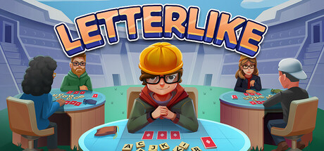
Letterlike scored 72/100 on Steam Analyzer — Good for a Strategy capsule. Top priority fix: [uniqueness_polish] Introduce a distinctive visual hook such as an iconic letter tile design, character signature element, or unique board aesthetic that sets Letterlike apart from generic word games and board game marketing.
Capsule scores by dimension
- Genre Clarity: 7/10 — Word game with casual party vibes. The capsule clearly communicates a word/card game through visible game boards, letter tiles, and playing cards on tables in front of characters. At TINY size, the colorful board with letter tiles and the multi-player scenario remain legible, though the specific roguelike deck-building mechanic is not immediately obvious from visuals alone. The casual, friendly art style aligns with indie word games but lacks the darker or more strategic iconography that would push genre identification to 8+.
- Title Readability: 8/10 — Bold orange title highly readable. The title 'LETTERLIKE' uses a bold, outlined orange sans-serif font positioned prominently at the top center against a blue sky background, ensuring excellent contrast and legibility at all sizes. At TINY size, the title remains clearly readable due to its thick letterforms and color separation from the background. The outline treatment prevents collapse and maintains clarity even at the smallest viewing size.
- Contrast & Color: 8/10 — Strong warm-cool separation. Warm orange title and character clothing pop distinctly against the cool blue sky and teal gaming table background, creating clear value separation throughout. The composition uses a saturated color palette with high contrast between foreground characters and background environment, maintaining legibility at SMALL and TINY sizes. In grayscale, the silhouettes remain distinct with good light-dark separation across all elements.
- Uniqueness & Polish: 7/10 — Polished casual art, somewhat generic. The illustration style is clean and professional with consistent rendering of stylized characters, furniture, and game boards that conveys a premium indie feel. However, the scene—players around a table in an office setting—is a fairly common visual trope for board game and card game marketing, lacking a distinctive hook or unique visual storytelling element that would differentiate it from similar casual games. The execution is solid but the concept feels familiar rather than memorable or innovative.
- Brand Consistency: 6/10 — Competent but generic character design. The art style is internally consistent with a cohesive color palette and rendering approach across all five characters and environmental elements. However, there are no immediately iconic character motifs, signature symbols, or distinctive palette cues that would make this image instantly recognizable as Letterlike in future marketing or community contexts. The friendly, diverse cast is appealing but lacks a memorable brand identity anchor.
- Composition: 7/10 — Clear focal point with balanced staging. The center character with the hard hat and crossed arms creates a strong primary focal point, with supporting characters and game tables arranged symmetrically to guide the eye. At SMALL and TINY sizes, the composition reads clearly with the central figure dominating and the background office/city setting providing context without clutter. Safe margins are respected, though the title placement at the very top leaves some breathing room and the bottom edge crops just above the card details, which could risk losing fine detail on some platforms.
What works
- Bold, readable title treatment. Orange outlined text stands out clearly against blue sky across all viewing sizes and maintains legibility even at TINY scale.
- Strong color contrast strategy. Warm tones of characters and title pop distinctly against cool blue and teal backgrounds, ensuring quick visual recognition during scroll.
- Professional, clean execution. Character illustrations and environmental elements are well-rendered with consistent style and no cheap or placeholder asset vibe.
- Symmetrical, balanced composition. Central focal character anchors the design with supporting elements arranged to guide attention without creating visual chaos.
What hurts the capsule
- Generic game scene setup. The 'players around table' concept is a common trope in board game and card game marketing, lacking distinctive visual storytelling.
- Weak brand identity anchors. No iconic character, symbol, or signature visual motif that would make the capsule instantly recognizable or memorable long-term.
- Limited roguelike/strategy signals. The visuals emphasize casual multiplayer fun but downplay the roguelike deck-building mechanic and synergy-focused gameplay that differentiates the title.
Priority fixes
- [uniqueness_polish] Introduce a distinctive visual hook such as an iconic letter tile design, character signature element, or unique board aesthetic that sets Letterlike apart from generic word games and board game marketing.
- [genre_clarity] Emphasize the roguelike deck-building aspect through visual cues like layered card stacks, upgraded tile highlights, or progression indicators that communicate strategy depth beyond casual play.
- [brand_consistency] Develop and feature a memorable character mascot or signature visual motif (e.g., a unique letter tile style, color pattern, or UI element) that becomes recognizable across future marketing and store pages.
Store copy priority fixes
- [hook_strength] Replace the opening with a stronger verb-driven hook: lead with 'Build synergistic word combos to topple roguelike bosses' or a similar action-focused line before mentioning 'challenging roguelike.'
- [uniqueness] Add a unique selling point that differentiates Letterlike: e.g., 'The only word roguelike where letter tile upgrades and word selection create emergent synergies' or highlight a specific mechanic that competitors don't have.
- [audience_targeting] Add one sentence clarifying the difficulty progression and audience: e.g., 'Whether you're a casual word fan or a roguelike veteran, difficulty options and New Game+ scale the challenge to your preference.'
- [feature_communication] Replace or condense the mobile review paragraphs (4.7 stars, #1/#2 rankings) into one single-line testimonial to free space for explaining how upgrades and synergies interact mechanically.
Related guides
Steam app ID: 3424020 · Tags: Strategy, Roguelike, Word Game, Roguelite, Minimalist