Scoring genre clarity...
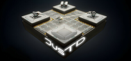
Tower Defense with resource- and base management! Waves of enemy robots with special abilities, shield and armor! Mining, refining and production for building and repairing! Environmental hazards and the best: the Orbital strike!
$11.993 user reviews
StrategyCasualTower Defense
Fairytales GamesMar 10, 2025