Scoring genre clarity...
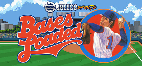
Bases Loaded brings classic baseball action back! Featuring a unique behind-the-pitcher view, 12 teams, arcade-style gameplay, and intense umpire disputes, this NES & SNES favorite delivers fast-paced fun. Play a full season or a quick game—step up to the plate and swing for the fences today!
$7.995 user reviews
Sports2DPixel Graphics
Sickhead GamesApr 18, 2025