Scoring genre clarity...
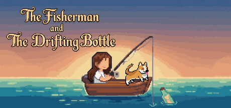
A relaxing desktop idle game with drift bottles. Residing at the bottom of your screen, it won't interrupt your work. Features 180+ fish and 2000+ translated notes. Use your fishing earnings to communicate with the world via bottles.
$1.995 user reviews
FishingIdlerCasual
Made in MoonFeb 24, 2026