Scoring genre clarity...
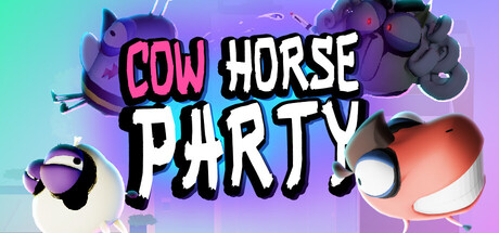
CowHorse Party capsule

CowHorse Party

This is a multiplayer party board game for 1-4 players, supporting online or local play. You'll take on the role of "big-eyed corporate slaves", rolling dice to advance on the city map, sabotaging each other, stealing coins, climbing the corporate ladder, and becoming the ultimate CEO.

Party GameMultiplayerFunny
松鼠系猪工作室To be announced

CowHorse Party scores 77/100 — better than 68% of Party Game capsules (n=417).

Released To be announced · By 松鼠系猪工作室

Quick text summary

CowHorse Party scored 77/100 on Steam Analyzer — Good for a Party Game capsule. Top priority fix: [genre_clarity] Incorporate a subtle board game element (dice, game board corner, or card visual hint) to differentiate from generic party games and communicate the turn-based mechanic.

Capsule scores by dimension

  • Genre Clarity: 8/10 — Party game identity clear. The vibrant, colorful aesthetic with playful character designs and chaotic visual style immediately signals a casual party game. At tiny size, the bold title and carnival-like character positioning communicate fun multiplayer action rather than serious gameplay. The visual energy and character-focused composition override any genre ambiguity.
  • Title Readability: 8/10 — Bold title reads well. The 'COW HORSE PARTY' title uses thick, high-contrast lettering (hot pink and white) that maintains legibility from full size down to tiny thumbnail. The text sits on a controlled gradient background that avoids busyness in the title zone. At small size the text remains clear, though some slight letter distortion occurs at the tiniest scale.
  • Contrast & Color: 8/10 — Strong value separation. The hot pink title pops sharply against the purple-to-cyan gradient background, and the white letters add secondary contrast layers. The characters in the upper right (purple tones) and right side (coral/orange tones) create distinct silhouettes that separate from the background. At tiny size, the warm orange character and cool purple character still read as distinct focal points against the dark Steam background.
  • Uniqueness & Polish: 7/10 — Distinctive art, some genericism. The cartoon character design with exaggerated features (big eyes, absurdist proportions) and the colorful corporate-satire visual theme feel specific and intentional. However, the visual style is somewhat aligned with other indie party games, and the composition relies on familiar character-showcase layout. The execution is polished but the core concept is not entirely novel in the indie casual space.
  • Brand Consistency: 7/10 — Recognizable character aesthetic. The big-eyed character design style is consistent and memorable, appearing to be the signature look for the game world. The purple and warm color palette feels deliberate and would likely appear across marketing materials. Without access to six store screenshots, internal cohesion appears solid based on the character rendering and design language, though no single iconic symbol or motif dominates.
  • Composition: 8/10 — Balanced focal hierarchy. The title sits center-top with clear emphasis, while character elements frame left and right without overwhelming the center. The composition creates depth with characters positioned at varying distances and the gradient background providing atmospheric layering. At small and tiny sizes, the focal point remains clear (title plus character cluster), and safe margins around edges protect against cropping loss.

What works

  • High-contrast title treatment. Hot pink and white lettering stands out boldly against the gradient, maintaining readability at all sizes including tiny thumbnail view.
  • Distinctive character design language. The exaggerated big-eyed cartoon aesthetic feels intentional and recognizable as a brand hook specific to this title.
  • Color gradient depth and balance. The purple-to-cyan background creates atmospheric separation while the coral and purple characters provide silhouette clarity without cluttering the composition.
  • Clear party game signaling. The chaotic, colorful, multi-character approach immediately communicates multiplayer fun and casual gameplay without ambiguity.

What hurts the capsule

  • Generic indie party game aesthetic. While polished, the overall visual style aligns closely with other casual indie titles and lacks a singular standout visual hook.
  • Limited visual storytelling of core mechanic. The capsule does not visually communicate the board game, dice rolling, or corporate ladder mechanics that differentiate this title from other party games.
  • Character positioning lacks intentional hierarchy. The characters feel randomly placed rather than positioned to guide eye movement or emphasize specific character roles or dynamics.

Priority fixes

  1. [genre_clarity] Incorporate a subtle board game element (dice, game board corner, or card visual hint) to differentiate from generic party games and communicate the turn-based mechanic.
  2. [uniqueness_polish] Add a distinctive visual element like a corporate briefcase, CEO badge, or money icon to signal the unique corporate-ladder selling point and increase visual uniqueness.
  3. [composition] Reposition the most distinctive character to a clearer primary focal point and reduce character count to strengthen hierarchy and reading at tiny size.

Store copy priority fixes

  1. [hook_strength] Rewrite the opening line of the short description from 'This is a multiplayer party board game...' to an action verb like 'Sabotage your friends as corporate slaves: roll dice, steal coins, and climb the CEO ladder in this meme-filled party game for 1–4 players.'
  2. [uniqueness] Add a 2–3 sentence paragraph explaining what makes CowHorse Party distinct (e.g., specific theme execution, unique sabotage mechanics, art style, or meme integration) compared to other party board games.
  3. [feature_communication] Expand the bullet-point section with concrete examples: replace 'Tons of cleverly designed mini-games' with specific game types (e.g., 'Racing challenges, trivia rounds, and quick-time events between turns').
  4. [feature_communication] Remove or restructure the duplicate detailed description so the first paragraph introduces the game in 2–3 sentences, then dedicate the rest to distinct feature breakdowns rather than restating the short description.

Related guides

Steam app ID: 3435170 · Tags: Party Game, Multiplayer, Funny, 4 Player Local, Board Game