Scoring genre clarity...

Crash Diet Simulator capsule

Crash Diet Simulator

Collect food, dodge bombs, and trigger a fake game crash in this chaotic arcade blast! Grow to 1000 lbs, and chase upgrades, and play offline or on Steam Deck.

$0.99
CasualArcadePixel Graphics
Zack GriffinJul 8, 2025

Crash Diet Simulator scores 78/100 — better than 82% of Casual capsules (n=10,153).

$0.99 · Released Jul 8, 2025 · By Zack Griffin

Quick text summary

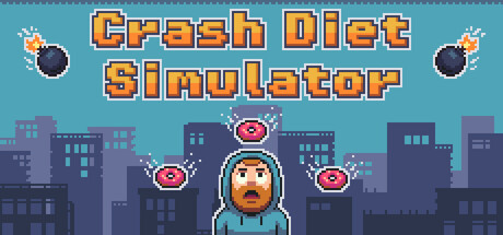
Crash Diet Simulator scored 78/100 on Steam Analyzer — Good for a Casual capsule. Top priority fix: [uniqueness_polish] Add a distinctive visual cue or effect that communicates the 'crash' or game-breaking mechanic (e.g., glitch effect, cracked UI frame, or visual distortion) to differentiate from generic retro casual games.

Capsule scores by dimension

  • Genre Clarity: 8/10 — Clear arcade casual action vibe. The pixel art style, chaotic food-collecting mechanic visible with the centered character and floating donuts, and bomb iconography instantly communicate a casual arcade game. At tiny size, the character silhouette, food items, and bombs remain visually distinct enough to suggest the genre, though some gameplay specifics blur. The retro aesthetic strongly anchors expectations toward indie arcade-casual rather than serious action.
  • Title Readability: 9/10 — Bold, legible at all sizes. The title 'Crash Diet Simulator' uses chunky orange pixel lettering with black outline on a bright blue background, creating excellent contrast and readability at full, small, and tiny sizes. The letterforms remain crisp and distinguishable even at thumbnail scale due to generous stroke weight and clear spacing. The title placement at the top with controlled background ensures it does not fight texture or character elements for attention.
  • Contrast & Color: 8/10 — Vibrant palette pops well. The warm orange title text, bright blue sky, cool purple-tinted city silhouettes, and white pixel highlights create strong value and hue separation against the Steam dark background. The character's warm skin tone and the orange donuts stand out clearly in the composition. At tiny size, the contrast holds up well due to distinct color blocks and minimal muddy mid-tones, though the city silhouettes lose some definition.
  • Uniqueness & Polish: 7/10 — Polished retro style, moderate uniqueness. The capsule demonstrates clean pixel art execution with intentional sprite-based styling and a cohesive retro aesthetic that fits the game's premise. The scene composition with a centered character, floating food, and city backdrop is well-crafted but visually familiar in the indie casual space. The uniqueness feels solid for its subgenre but not revolutionary; it executes the theme competently without a distinctive visual hook that would make it immediately memorable against other retro casual games.
  • Brand Consistency: 7/10 — Consistent pixel style, limited icon. The capsule maintains a unified pixel art aesthetic with matching character sprite, food assets, bombs, and UI elements that all appear to come from the same visual language. The color palette and retro style reinforce the game's identity across visible elements. However, there is no distinctive character motif, signature symbol, or memorable brand marker that would make this capsule instantly recognizable in isolation; the identity relies on competent execution of a familiar retro template rather than a unique hook.
  • Composition: 8/10 — Clear hierarchy, well-balanced layout. The composition uses a strong three-level structure: orange title at top, character centered as primary focal point in the middle, and city silhouette baseline at bottom, creating clear depth and natural eye flow. The floating donuts and bombs around the character guide attention without competing for dominance. At small and tiny sizes, the character remains the unambiguous focal point, and the layout avoids clutter and dead space effectively, though the city background becomes less detailed at thumbnail scale.

What works

  • Excellent title legibility. The bold orange pixel lettering with black outline and blue background provides exceptional readability at all viewing sizes including tiny thumbnails.
  • Strong color contrast. The warm orange, bright blue, and cool purple palette creates vibrant separation against the Steam dark background with no muddy blending.
  • Clear focal hierarchy. The centered character sprite serves as an unambiguous primary subject with supporting floating elements that enhance rather than distract from the composition.
  • Coherent pixel art style. All visual elements from character to food to bombs share a consistent sprite-based aesthetic with matching quality and detail level throughout.

What hurts the capsule

  • Generic retro template feel. While well-executed, the overall visual presentation relies on familiar indie casual pixel art tropes without a distinctive signature element or memorable brand marker.
  • Limited gameplay storytelling. The capsule shows character, food, and bombs but does not clearly communicate the 'fake crash' mechanic or the specific 1000 lbs growth goal that makes this game unique.
  • City silhouette lacks detail. The purple-tinted background buildings lose definition and visual interest at small sizes, creating a somewhat flat baseline that does not add depth to the composition.

Priority fixes

  1. [uniqueness_polish] Add a distinctive visual cue or effect that communicates the 'crash' or game-breaking mechanic (e.g., glitch effect, cracked UI frame, or visual distortion) to differentiate from generic retro casual games.
  2. [genre_clarity] Include a clearer visual reference to the weight-gain or inflation mechanic (e.g., character size progression indicator or visual scale feedback) to make the core gameplay loop more immediately apparent at small sizes.
  3. [composition] Enhance the background city with slightly more visual complexity or a unique landmark to add depth and visual interest without sacrificing readability at thumbnail scale.

Store copy priority fixes

  1. [feature_communication] Clarify what happens at 1000 lbs by rewriting to: 'Reach 1000 lbs to trigger a game-breaking crash ending and unlock a special bonus round' or similar, so the milestone feels rewarding and the fake crash is clearly the victory condition.
  2. [uniqueness] Expand the upgrade section with a sentence like 'Over 10 unlockable power-ups transform your playstyle each run,' to emphasize the replayability angle and differentiate from basic dodge games.
  3. [hook_strength] Consider opening the detailed description with 'Eat big, survive chaos, and crash the system' to front-load the transgressive humor and fake-crash hook more directly.

Related guides

Steam app ID: 3436830 · Tags: Casual, Arcade, Pixel Graphics, Action, 2D