Cat Lottery Shop scores 72/100 — better than 41% of Simulation capsules (n=5,188).

Quick text summary

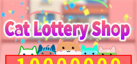
Cat Lottery Shop scored 72/100 on Steam Analyzer — Good for a Simulation capsule. Top priority fix: [uniqueness_polish] Add a distinctive visual element like a glowing jackpot symbol, ticket imagery, or character expression that hints at the lottery mechanic and differentiates from generic cat-game capsules.

Capsule scores by dimension

  • Genre Clarity: 7/10 — Casual simulation with cute charm. The row of stylized cats with happy expressions and the bright, playful aesthetic immediately signal a casual indie game with light-hearted tone. The shop counter and lottery ticket imagery reinforce the simulation/tycoon gameplay loop. At tiny size, the cat silhouettes and colorful confetti remain recognizable, though the specific lottery mechanic becomes less clear without reading the title.
  • Title Readability: 8/10 — Bold, legible title with strong contrast. The white title with purple/magenta outline stands out clearly against the pink background at all sizes, and the letterforms remain distinct even at tiny thumbnail scale. The chunky sans-serif font is intentionally bold and maintains readability through small reductions. At tiny size, while individual letters blur slightly, the overall word shape and color separation remain decipherable.
  • Contrast & Color: 8/10 — Vibrant palette with strong value separation. The warm pink background contrasts well with the cooler cyan and multicolored confetti elements, creating visual pop against Steam's dark background. The white title and cat characters have clear silhouettes that separate from the mid-tone pink. In grayscale test, the title maintains strong edge definition and the cat shapes remain distinct, though the confetti becomes less visible.
  • Uniqueness & Polish: 6/10 — Charming but relies on genre conventions. The cute cat aesthetic and colorful confetti execution are polished and appealing, matching the wholesome indie game market well. However, the design follows familiar cute-indie-game visual patterns seen in titles like Little Kitty, Big City and Moonstone Island without introducing a distinctive visual hook or unique selling point. The composition is competent but generic within the casual-cute category.
  • Brand Consistency: 7/10 — Coherent cute aesthetic with character appeal. The art style is internally consistent with soft-edged, rounded characters and a warm color palette that would carry through to in-game assets. The cat character lineup establishes a recognizable identity motif that could anchor brand recall. Without access to the nine store screenshots, consistency appears strong within this single image, though it would benefit from unique character design elements that distinguish it from other cat-themed indie games.
  • Composition: 7/10 — Clear hierarchy with balanced focal points. The title anchors the top with strong visual weight, while the cat characters create a secondary focal point at the bottom that draws the eye naturally. The confetti and gradient background provide atmosphere without competing for attention. At small and tiny sizes, the arrangement remains readable with the cats and title clearly separated, though the composition feels slightly conventional—the cats sit centered at the bottom, which is safe but not particularly distinctive.

What works

  • Title contrast and readability. White text with purple outline maintains legibility at all viewing sizes and pops clearly against the pink background.
  • Coherent art direction. Soft, rounded character design and warm color palette create a unified, immediately appealing cute aesthetic.
  • Clear genre signaling. The cat lineup, shop counter, and playful confetti communicate a casual, lighthearted simulation game without ambiguity.

What hurts the capsule

  • Generic cute-indie composition. The centered cat row at the bottom and confetti-filled background follow common indie game visual patterns without memorable distinction.
  • Limited gameplay visual hooks. The capsule communicates tone and genre but doesn't visually hint at the specific lottery-shop tycoon mechanic or what makes this simulation unique.
  • Confetti loses impact at tiny size. Scattered particles blur and become visually insignificant at thumbnail scale, reducing the sense of celebration and polish.

Priority fixes

  1. [uniqueness_polish] Add a distinctive visual element like a glowing jackpot symbol, ticket imagery, or character expression that hints at the lottery mechanic and differentiates from generic cat-game capsules.
  2. [composition] Consider off-center or asymmetrical character placement to create visual tension and make the layout more memorable at small sizes.
  3. [contrast_color] Increase saturation of the cat characters slightly to ensure they maintain visual pop against the pink background at tiny thumbnail scale.

Store copy priority fixes

  1. [uniqueness] Add one specific mechanical differentiator after the feature list—e.g., 'Manage the only lottery shop where customer decisions directly affect draw odds' or highlight what makes the progression curve or economy system distinct from other management sims.
  2. [hook_strength] Rewrite the closing line to something concrete and enticing instead of 'There's more to this world than meets the eye'—e.g., 'Discover secret trading opportunities and rare draw modifiers as you grow your empire' to strengthen the emotional payoff.
  3. [audience_targeting] Add a single sentence about the game's pace and accessibility—e.g., 'Play at your own pace with no time limits; perfect for relaxing management and collection gameplay' to directly reinforce the comfort categories and solo-player focus.

Related guides

Steam app ID: 3438950 · Tags: Simulation, Casual, Life Sim, Incremental, Time Management