Scoring genre clarity...
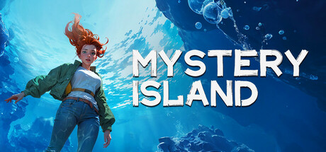
The adventure begins when Ada, a young explorer, receives a mysterious selfie from her sister, who in fact disappeared months ago. ...... The background of the selfie is a mysterious island with blood-red sea water. Ada decides to go out on the sea to look for her sister……
$6.996 user reviews
Point & ClickPuzzleAdventure
TAPROMANCEMay 21, 2025