Red or Blue scores 68/100 — better than 23% of Choices Matter capsules (n=2,098).

Quick text summary

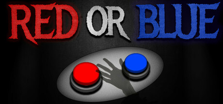
Red or Blue scored 68/100 on Steam Analyzer — Solid for a Choices Matter capsule. Top priority fix: [genre_clarity] Add environmental or thematic context around the buttons (dystopian setting, character silhouette, or iconic motif) to establish the narrative/simulation genre without sacrificing the core button imagery.

Capsule scores by dimension

  • Genre Clarity: 5/10 — Unclear genre, choice mechanic visible. The red and blue buttons clearly communicate a choice-based mechanic and decision theme, but at tiny size the visual reads more as a generic interface demo than a specific game genre. The dark background and button imagery don't immediately signal indie, simulation, or narrative-driven gameplay—it could be interpreted as a puzzle game, casual clicker, or UI showcase instead.
  • Title Readability: 9/10 — Excellent typography, bold hierarchy. The title 'RED OR BLUE' uses strong, readable letterforms with excellent color separation (red, gray, blue) that remain crisp and legible even at tiny thumbnail size. The strategic placement above the button imagery ensures the text never competes with or blends into background elements, and the color-coded words directly reinforce the core mechanic.
  • Contrast & Color: 8/10 — Strong value separation, clear silhouettes. The bright red and blue buttons pop distinctly against the dark gray/black background, creating excellent contrast that holds up in quick scroll and at small sizes. The grayscale test confirms crisp separation between the metallic button hardware and the dark void, though the mid-tone gray buttons could be slightly more saturated for maximum impact at tiny size.
  • Uniqueness & Polish: 6/10 — Polished execution, conceptually generic. The 3D button render is clean and well-executed with realistic metallic reflections and shadow work, but the 'red button vs blue button' choice device is a familiar trope without a distinctive visual hook or unique selling point. The capsule communicates the mechanic competently but lacks memorable art direction, character presence, or thematic storytelling that would distinguish it from other choice-based indie games.
  • Brand Consistency: 5/10 — Minimal identity, functional but forgettable. The capsule relies entirely on the red/blue button concept with no distinctive character, symbol, or signature visual motif that could be recognized across marketing materials. Without reference to the 9 store screenshots, the imagery alone offers no memorable brand identity—it reads as a generic choice interface rather than a recognizable game brand.
  • Composition: 8/10 — Strong focal point, balanced layout. The centered button pair creates a clear, unambiguous primary focal point that dominates the frame, with the title positioned above in secure space away from edge cropping. The symmetric composition and negative space work well at all sizes, and the depth layering (title, buttons, shadow/background) creates clear visual hierarchy without clutter.

What works

  • Title readability excellence. Color-coded typography (RED, OR, BLUE) remains crisp and readable at tiny sizes with perfect contrast separation against the dark background.
  • Clear focal point and hierarchy. The centered button pair is the unambiguous hero element, and title placement above ensures no competing visual weight or composition confusion.
  • Strong color contrast pop. The bright red and blue buttons create excellent value separation from the dark background that persists through scroll and maintains readability at small thumbnail sizes.

What hurts the capsule

  • Generic choice mechanic presentation. The red button vs blue button concept is a familiar trope without distinctive visual storytelling or mechanics hint that sets this apart from other choice-based games.
  • No memorable brand identity. The capsule offers no iconic character, symbol, or signature palette that would make the game recognizable in a crowded store—it feels like a functional interface demo rather than a branded game.
  • Genre ambiguity at small size. At tiny thumbnail size, the button interface doesn't clearly communicate that this is a narrative simulation or choice-driven indie experience; it could be mistaken for a casual puzzle or interface tool.

Priority fixes

  1. [genre_clarity] Add environmental or thematic context around the buttons (dystopian setting, character silhouette, or iconic motif) to establish the narrative/simulation genre without sacrificing the core button imagery.
  2. [uniqueness_polish] Introduce a distinctive visual hook such as a character, symbol, or art style element that appears consistently across store materials to build brand recognition and premium feel.
  3. [brand_consistency] Establish a signature color accent, character motif, or visual language (beyond red/blue) that could anchor future promotional materials and create lasting brand identity.

Store copy priority fixes

  1. [hook_strength] Rewrite the opening to emphasize the psychological or survival stakes: 'You wake in a locked room with no memory. Two buttons. One choice wrong, and you may never leave.' to convey threat rather than just mystery.
  2. [feature_communication] Add a sentence or two explaining the core gameplay loop across the full 120 minutes—e.g., 'Each button press reshapes the room and your options. Some choices are traps. Others are keys. Repeat until all five lamps burn bright... or until you run out of chances.'
  3. [genre_clarity] Strengthen horror signals by adding atmospheric or consequence language such as 'The air grows colder with each wrong move' or 'Your mistakes leave scars on the room itself' to justify the Psychological Horror tag.
  4. [uniqueness] Add a differentiating detail that sets Red or Blue apart, such as: 'No two playthroughs are identical' (if true to roguelike tag) or 'Your decisions reshape not just the room, but the rules themselves' (immersive sim angle).

Related guides

Steam app ID: 3439320 · Tags: Choices Matter, Simulation, Atmospheric, Roguelike, Immersive Sim