Scoring genre clarity...
Scoring genre clarity...
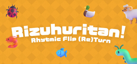
Rizuhuritan! Rhythmic Flip (Re)Turn scores 72/100 — better than 42% of Casual capsules (n=10,512).
Positive (18 reviews) · $2.99 · Released Apr 6, 2026 · By 青木とと / Toto Aoki (ˊᗜˋ*)
Rizuhuritan! Rhythmic Flip (Re)Turn scored 72/100 on Steam Analyzer — Good for a Casual capsule. Top priority fix: [composition] Create a single focal point by positioning one signature creature larger in the center foreground, with supporting creatures arranged behind to guide the eye and establish visual hierarchy.
Steam app ID: 3440840 · Tags: Casual, Rhythm, Cute, Indie, Colorful