Scoring genre clarity...
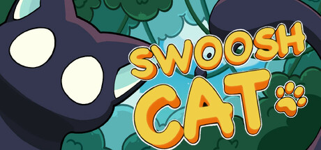
SwooshCat capsule

SwooshCat

SwooshCat is a vibrant precision-platformer adventure. Leap, dash, slash, stab, roll, and ricochet your way through a charming pixel world as you help a brave little cat 🐾 explore and battle!

$4.99Positive(46)
AdventureAction RPG2D Platformer
PixelForestStudioAug 13, 2025

SwooshCat scores 77/100 — better than 84% of Adventure capsules (n=7,922).

Positive (46 reviews) · $4.99 · Released Aug 13, 2025 · By PixelForestStudio

Quick text summary

SwooshCat scored 77/100 on Steam Analyzer — Good for a Adventure capsule. Top priority fix: [genre_clarity] Add a subtle action visual cue such as a dash arc, sword slash, or dynamic motion line to communicate the platformer-action hybrid gameplay at TINY size.

Capsule scores by dimension

  • Genre Clarity: 8/10 — Clear action-platformer with charm. The large cat head silhouette with expressive eyes and playful pose immediately signals a lighthearted action game, while the dynamic yellow title treatment and paw icon reinforce platformer energy. At TINY size, the cat face remains the dominant focal point and successfully communicates a quirky indie action title, though the exact precision-platformer subgenre is not immediately obvious without context.
  • Title Readability: 8/10 — Bold golden text reads well. SWOOSH CAT uses a thick, bright golden-orange sans-serif with strong outlines that maintains legibility across FULL, SMALL, and TINY sizes. The title is centered in the upper-middle region with clean dark background support, and the outline treatment prevents collapse even at thumbnail scale. The paw icon punctuation adds personality without compromising clarity.
  • Contrast & Color: 8/10 — Vibrant pop against dark Steam background. The golden-yellow title and warm orange tones contrast sharply against the deep teal-blue background and dark purple cat silhouette, creating strong value separation that reads well in grayscale. The cream-white eyes and light teal leaf foliage add secondary contrast layers that prevent the design from feeling flat. At TINY size, the warm-cool color opposition remains clear and prevents muddiness.
  • Uniqueness & Polish: 7/10 — Polished indie style, somewhat familiar. The art demonstrates solid craft with smooth gradients, clean line work, and a cohesive illustrated aesthetic that avoids the generic asset-pack look. The expressive cat character and leafy environment create a charming, specific world, but the overall visual language sits comfortably within established indie platformer conventions without a particularly standout unique hook. The execution is premium and intentional rather than innovative.
  • Brand Consistency: 7/10 — Consistent illustrated style, recognizable cat. The cat face with white circular eyes and purple coloring appears to be a signature character asset that would be identifiable across marketing materials and gameplay screens. The warm golden typography palette and soft illustrated art direction suggest a coherent brand identity. However, without reference to the 12 store screenshots, it is difficult to assess whether this capsule fully represents the game's visual identity across all materials.
  • Composition: 8/10 — Strong focal point, balanced layout. The large cat head on the left side serves as the primary anchor with the golden title stacked on the right, creating a clear visual hierarchy and balanced composition that guides the eye naturally. The layered depth (dark cat silhouette, mid-tone foliage, light background) prevents flatness and supports readability at SMALL and TINY sizes. Title placement avoids edge clipping and maintains safe margins for Steam cropping.

What works

  • Expressive character focal point. The cat's large, detailed face with distinctive white eyes immediately draws attention and communicates personality at all viewing sizes.
  • Outstanding title contrast and legibility. Golden-orange thick serif with strong outlines remains crisp and readable even at tiny thumbnail scale without loss of appeal.
  • Warm color harmony with strong separation. The golden-teal-purple palette creates natural visual contrast and prevents the design from blending into the dark Steam background.
  • Balanced composition with clear hierarchy. The cat-on-left, title-on-right arrangement creates an intuitive visual flow that doesn't feel cramped or imbalanced at any size.

What hurts the capsule

  • Genre subgenre not immediately apparent. While 'action game' is clear, the specific precision-platformer nature and combat mechanics are not visually communicated at TINY size.
  • Limited gameplay visual storytelling. The capsule showcases character charm but does not visually hint at core mechanics like dashing, slashing, or ricochet movement that define the experience.
  • Foliage detail loses prominence at tiny scale. The leafy background elements add visual richness at full size but compress into visual noise at TINY size, reducing overall clarity.

Priority fixes

  1. [genre_clarity] Add a subtle action visual cue such as a dash arc, sword slash, or dynamic motion line to communicate the platformer-action hybrid gameplay at TINY size.
  2. [uniqueness_polish] Incorporate a signature visual motif or UI element from gameplay (leap effect, dash trail, or combat pose) to elevate the design above typical indie platformer conventions.
  3. [composition] Reduce foliage density in the upper-right area to ensure the mid-tone background remains clean and doesn't compete with the title at small viewing sizes.

Store copy priority fixes

  1. [uniqueness] Add a specific differentiator comparing SwooshCat to similar games (e.g., 'Unlike traditional Metroidvanias, your dash blade reshapes level design and combat fundamentally') to clarify what makes this distinct within the crowded precision-platformer space.
  2. [feature_communication] Clarify the game's progression scope: specify the number of worlds, bosses, or estimated playtime for different difficulty levels to help players set expectations.
  3. [audience_targeting] Explicitly mention whether story/narrative is a core draw or purely mechanical/skill-driven to help story-focused vs. gameplay-focused players self-select.
  4. [hook_strength] In the short description, lead with the dash-as-multitool hook ('Master a shape-shifting dash that slices, solves, and launches you through impossible platforming challenges') rather than listing generic verbs second.

Related guides

Steam app ID: 3442170 · Tags: Adventure, Action RPG, 2D Platformer, Hack and Slash, Exploration